4 Email Newsletter Design Tips from the Pros. With all the different considerations and factors to take into account when creating your emails, designing good looking ones can be challenging. That’s why we’ve compiled this list of four tips from email marketing experts to help you.
Great looking emails will always require a degree of creativity. The tips below, however, represent more fundamental design guidelines that should be applied to just about every email sent. By following these tips, you’ll be well on the way to having visually appealing emails that’ll get you more clicks too.
Tip 1: Avoid Information Overload – Matt Sanocki
Businesses have a lot going on that they want to communicate with their email subscribers, but they don’t want to spam people with too many emails. The solution for many email marketers is, sadly, to cram all the information they can into the one email. This results in a very long email for people to read.
The problem with this solution is that people opening their emails are rarely looking to do a lot of reading. With over two thirds of people checking emails while watching TV, and a third while commuting to work, their attention spans are not going to be suited to taking in too much information.
For these reasons, emails should be kept as concise as possible.
This is one of Matt Sanocki’s, the founder of Mineral.io, top email design tips. Looking at the difference between the two emails below, it’s not hard to see why.
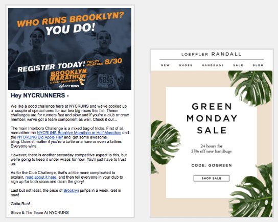
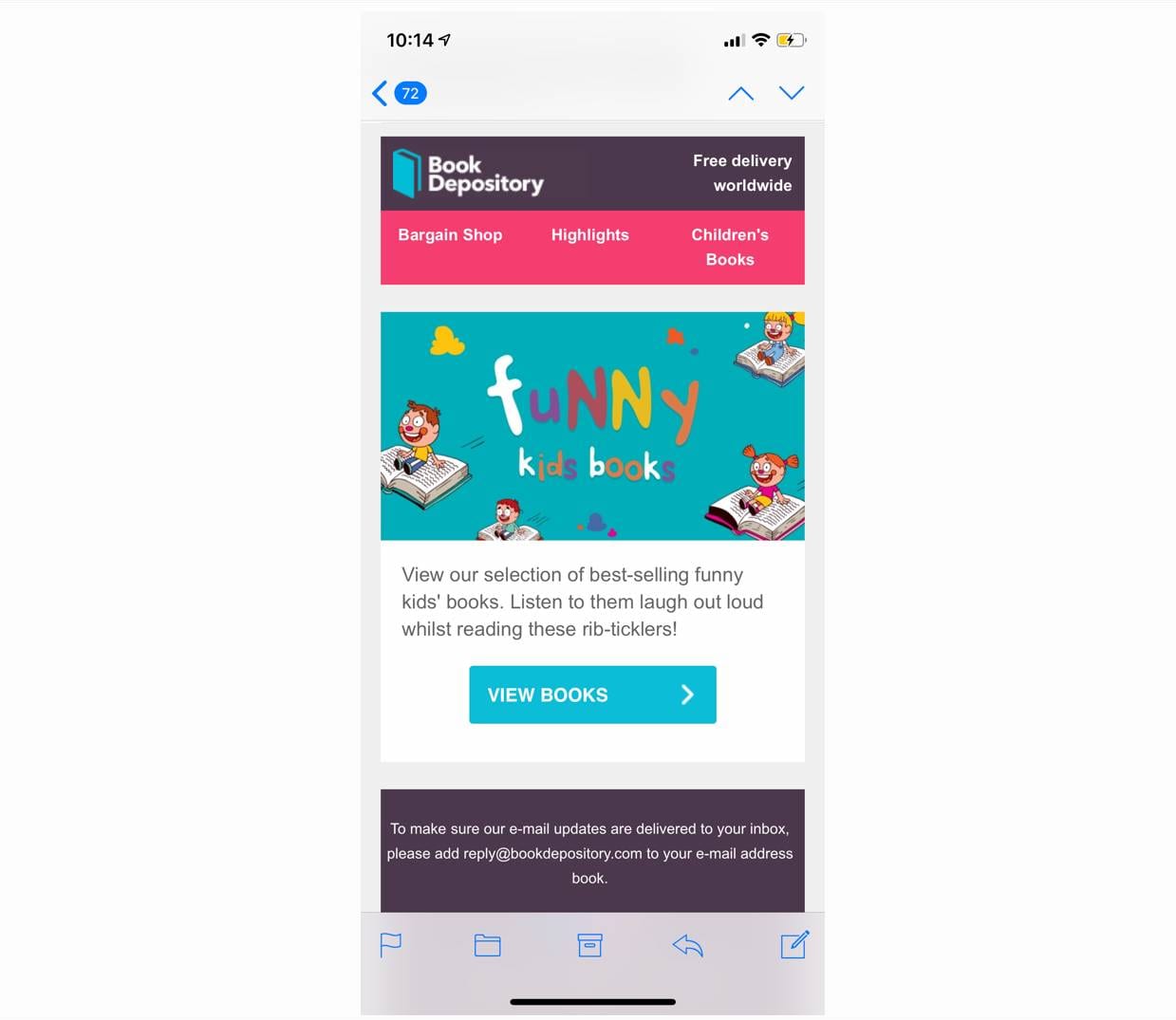
Instead of inserting large slabs of text into your emails, Matt recommends only using text that is easily scannable. This gives your message a better chance of getting across to people involved in another activity while also checking their emails.
This is especially true when it comes to email newsletters.
Seeing as these emails invariably include multiple stories and announcements, making the email easily scannable is essential to avoid your subscribers from becoming overloaded with information.
Including a link to a webpage where people can learn more about a particular story or event after a short description is a great way to ensure that people receive the information they’re after without overwhelming them.
Matt Sanocki
Matt is a New York based digital marketer who helps businesses improvement their conversions and customer experience on a freelance basis. He has extensive experience in digital marketing and strategy, project management, as well as UX design. Matt as also founded Mineral.io, a digital marketing company.

Tip 2: Consistent Branding – Neil Patel
The importance of branding cannot be underestimated for any business no matter how small. Strong brands enable customers to easily identify your business and foster a sense of familiarity in people who only occasionally encounter your business meaning that when they need your services, your brand will be top of mind.
Once you created a strong brand with a recognizable logo, font, and color scheme, you’ll want to make sure this appears wherever your business has a presence. This includes your website, any printed materials, and, of course, your emails.
By ensuring consistent branding in your emails, your recipients will instantly recognize that the email is from you as opposed to being from an unwanted source. Any favorable connections the recipient has associated with your brand in their mind will then help with getting them to convert. For example, if people know your products are built to a high calibre and are of a high quality, then your email doesn’t have to work as hard to convince them of this. The branding has already achieved this for you.
Neil Patel, one of the top influencers in digital marketing, has a detailed blog post on how you can achieve consistent branding with your emails. This post looks at how Hewlett-Packard utilized consistent branding across an email and landing page campaign to achieve phenomenal results.
If you don’t have time to read the whole post, the key points to take away for when you design your next email campaign are:
- Ensuring your logo is pride-of-place in the header at the top of your email
- Your brand’s colors and font are prominent
- The overall look of your email should be reminiscent of your website’s design
As an example, take a look at Target’s email below on the left and how it retains a lot of the design elements from their website on the right.
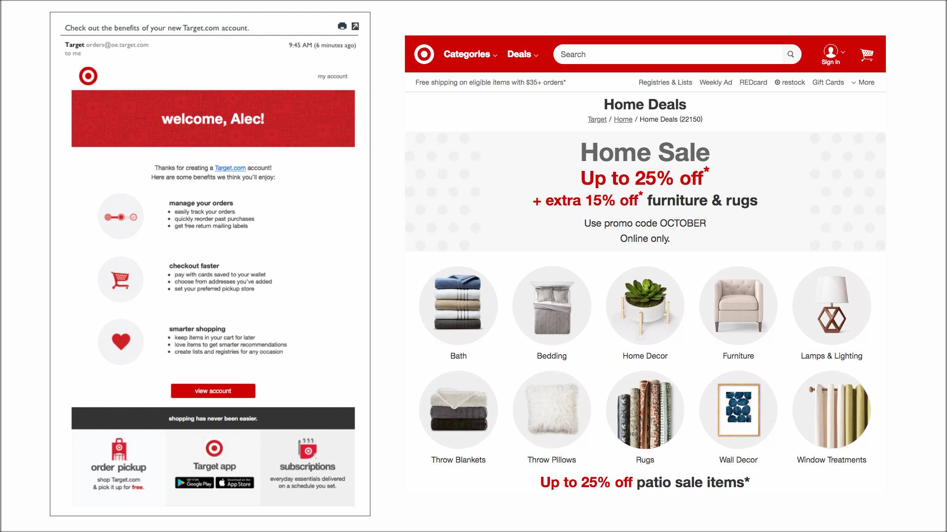
As you can see, the color scheme, fonts, and design principles are consistent across both the email and website. This re-enforces the strong Target brand and makes the email instantly recognisable and familiar.
Neil Patel
Neil Patel is one of the internet’s most prominent digital marketers. He has helped countless small and medium sized businesses achieve success online and has been nominated as one of the top influencers on the web by the Wall Street Journal.
Tip 3: Ensure Your Emails Look Great on Mobile, Too – Aubrey Morgan
If you’re still designing emails to look good on desktops first and leaving mobile as an after-thought, then you’re well and truly behind the times. As of 2018, over half of all emails are opened on mobile devices. This means that how your emails look on these much smaller screens is just as important as how they render on desktops.
Unfortunately however countless emails are sent each day that display horribly on mobiles. Just take a look at the email below.
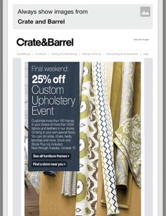
Remember that the screenshot above was taken on a small mobile device. This makes most of the text far too small to be legible, forcing the subscriber to pinch and zoom in to read it. Compare this to the much better designed email below.
This email has clearly been designed with mobile in mind. While nothing in the email is particularly striking, all the elements are easy to read on smaller screens and the links are easy to click.
Designing emails to look great on matter what size screen they appear on is known as responsive design. This includes having images scale appropriately, text wrapping to ensure no horizontal scrolling, and font sizes changing to maintain readability.
Responsive design is Aubrey Morgan’s top email design tip. Given the difference between a well designed email and a poorly designed one on click-through rates and conversions, this is no surprise. In her role as Email Marketing Manager at MuleSoft, she noticed a engagement with emails they were sending more than double after they started utilizing responsive design.
Achieving responsive design so that your emails look great regardless of what device they are displayed on can be challenging. We understand this frustration. That’s why SmartrMail makes it quick and easy to compose emails that display correctly on both computers and phones. Learn more about how you can easily create email newsletters with SmartrMail here.
Aubrey Morgan
Aubrey Morgan is a senior manager of digital marketing at MuleSoft. Prior to her current role, she was email marketing manager at MuleSoft. These roles have gift Aubrey with extensive experience with email and to know what works and what doesn’t.
Tip 4: Have a Single, Clear CTA – David Moth
Call-to-action, or CTA, is perhaps the most important part of your email. This is because it is where you tell your subscribers what action you want them to engage in. Whether it’s to buy your products, RSVP to an event, or some other action, just about every email should include a CTA.
However, often CTAs are not obvious because they have either been designed poorly or it is competing for attention among many other CTAs. Below is an example of an email with numerous poorly designed CTAs.
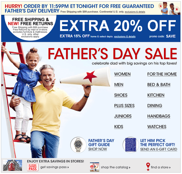
Not only does this email have far too many CTAs, but they are all merely links to various pages.
As with the first tip on this list, good emails avoid overwhelming readers with actions to engage in and instead only have one clear CTA. This provides a clear direction for people to head after reading the email and makes the transition between the email and the next step seamless.
If you present your subscribers with multiple paths to choose between, as in the email above, you run the risk of people abandoning your email altogether out of indecisiveness.
On the other hand, if you don’t provide a CTA, then people have no clear direction to head after reading your email. This makes it hard for them to engage in a behaviour that will increase your bottom line such as making a purchase from your online store.
After you have narrowed it down to a single CTA, you then also need to ensure that it is displayed prominently in your email. If people can’t easily find your CTA, then you’re missing out on clicks. The image below is a good example of this.
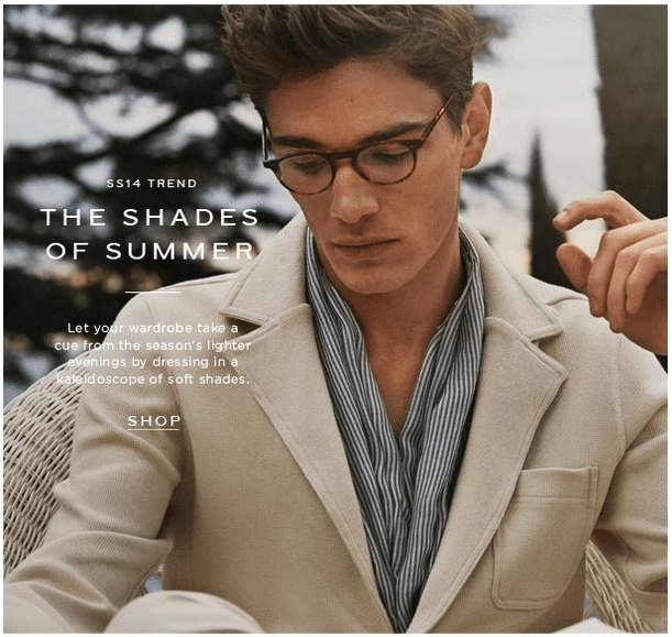
This email from Reiss is simple, doesn’t overload the recipient with information and, importantly, only has a single CTA. The problem, however, is that this CTA fails to stand out adequately against the image. This makes it difficult to notice and recognise that it is a link through to their store.
Contrast this with the example below.
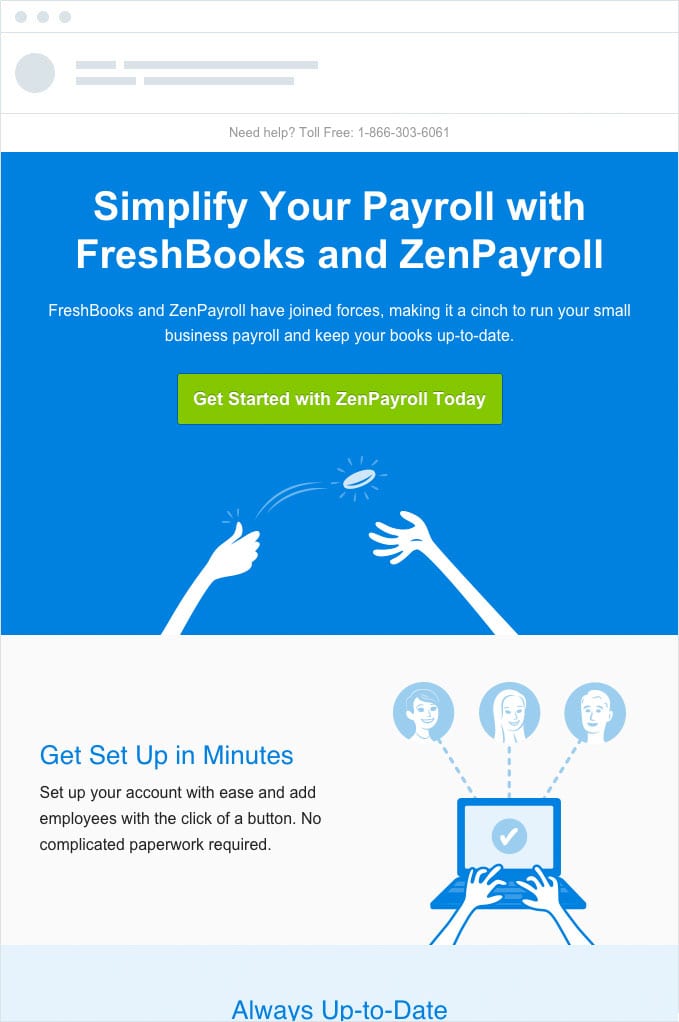
This CTA in the ZenPayroll email satisfies all the main criteria. It’s front and center in the email making it highly visible to people. The green on blue color also makes it stand out from the background which likely makes it the first thing you notice upon reading the email and gives it the appearance of a button. What’s more, the wording of the CTA makes it clear what behavior ZenPayroll wants the subscriber to engage in. All of this would result in a greater click through rate for this CTA compared to the other examples of poor CTA implementations.
David Moth goes into CTA design in emails in much more detail on his blog. He talks about why good CTA design and placement in emails is one of his top email tips and offers multiple examples of good and bad cases. If you feel that your CTAs need improvement, head over to his blog to have a read.
David Moth
David Moth is a regular blogger at econsultancy.com. His blogs cover a wide range of topics from digital marketing to ecommerce and UX and are well thought out and thorough. After reading some of his work, it quickly becomes clear that he knows what he is talking about.
Where to Find email design Tips
These four tips are some of the most fundamental design tips that should be taken into consideration for all emails. More specific ones will often depend on the type of email you’re sending and its purpose. We will often mention these here on our blog, so keep an eye out for them. In the meantime, you can check out our other posts tagged with Email Design here.
Read summarized version with