As a merchant, you likely spend a decent amount of time and money trying to get potential customers to visit your online store.
However, as you’re well aware, getting visitors is only half the challenge. The second, arguably more challenging half, is getting them to make a purchase.
Unfortunately, most customers don’t convert on their first visit. Instead, they will make multiple visits before they become a paying customer.
The good news is that there are plenty of strategies you can use to not reduce the average number of visits it takes customers to convert, but also increase the likelihood of customers converting on their first visit.
And one of the most effective strategies is popups.
With popups, you can highlight special offers and discounts to drive sales or collect email addresses to entice people to purchase later on.
Here’s a short vid on creating the perfect Pop Up:
The effectiveness of popups
Not all popups are created equal however.
While the average conversion rate for all popups across the web is 3.09%, the top performing 10% of popups achieve an astonishing average conversion rate of 9.28%.
That’s nearly an email list signup for every 10 customers that view the popup!
Which may seem like a lot, but when popups attract visitors’ attention with an eye-catching design that isn’t intrusive, contain relevant content, and are placed and timed well, it’s definitely achievable.
However, to achieve the average conversion rate, let alone anything approaching 10%, it’s not enough to simply set up a popup live on your store and call it a day. There are certain best practices you should be following.
Having these best practices in mind when you’re designing your popup will help you create one that achieves an above-average conversion rate.
Popup design best practices
1) Tell A Story
In 2026, it’s not enough to design a beautiful popup, you need to tell a story. Social media has trained shoppers to connect with the story of a brand told across multiple engagements. A popup with a discount just isn’t enough to capture an email anymore. You need to connect with your site visitors and engage them.
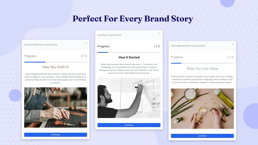
Two of the best ways to do this in 2026 is with gamified Brand Story “Popups” from SalesPop by Relay. Use the endowment effect of progressively earning rewards to not only drive more email capture, but a higher conversion rate from those captured emails.
When telling a story it’s important to first engage, then educate, then close. Use three sequential panels to do this with image and text, video, and surveys. For me, video is the king of engagement and I recommend always using a video as your first panel to stop a visitor in their tracks. This video can tell how your products are made or the story of how your brand was founded to solve a specific problem.
After engaging your visitors follow with survey to capture their interest if you have multiple product lines for different segments of customers. Otherwise go deeper into deduction with another video or a compelling image and written story panel.
Finally, you close the deal. SalesPop will reveal the earned discount giving the merchant a set time redeem the discount. This will often drive a sale during their shopping session, and if it doesn’t you can use the captured survey data to personalize follow up emails.

2) Include a compelling call-to-action
What action you want customers to take with your popup depends on your goal.
For example, if you want to grow your email list, then you’ll obviously want customers to enter their email address. If you want to increase your conversion rate, then you’ll want them to add products to their cart and check out.
Whatever action you want your customers to take, however, you can’t simply just tell them to do so and expect they follow suit.
Take the two popup examples below that are both trying to collect email addresses.

Which one do you think is more effective?
While the example on the left makes a vague promise of coupons in return for signing up, the popup on the right provides a much more specific and enticing offer which clearly communicates the value of signing up.
The more enticing your offer and the better you clearly communicate the value a customer will receive from whatever action you want them to take, the better your popup conversion rate will be.
Don’t forget about your CTA button
With such a bland call-to-action of “sign up for coupons”, it’s not surprising that the popup button is simply “submit”.
What is a bit more surprising however is despite the popup on the right having a decent headline and copy, the call-to-action button is simply “subscribe now”.
Coming up with an engaging call-to-action button that reiterates your offer, like in the example below, is one of those final touches that will make your popup more effective.
3) Use imagery to attract visitors’ attention
Popups are effective because they are attention-grabbing. So it makes sense that the most effective popups will be the ones that do the best job of attracting attention.
And one of the best ways to attract people’s attention is with imagery. Especially in commerce.
In terms of what imagery works best, here are a few ideas:
- Images of your products
- People who represent your target audience or ideal customer
- Showing your products being used
The popup on Lindsay Letters’ Shopify store is a good example of these points in action.
If you decide not to use imagery, the other route to creating an eye-catching design is to play around with other elements of your design. Such as using bright, contrasting colors and even experimenting with unique shapes like the one below from Gaiam.

4) Match the design of your store and brand
When it comes to the look and feel of your popup, you should aim to have it match the look of your store and, more importantly, your brand.
This means you should be using the same fonts as your store uses as well as the same color scheme. If you decide to use any imagery, it should also match the imagery you already have on your site.
La Colombe’s popup is a good example of one that matches their store.
Not only does matching your popup design with your store’s design make your popup less jarring and intrusive, but it also gives you a good starting point if you’re stuck for ideas or design inspiration.
5) Use a contrasting color for your CTA button
In addition to making sure your popup matches your store’s design, the other design trick to make it engaging is to give the call-to-action button a contrasting color. In other words, it should be close to the opposite color of the rest of your popup window.
This makes the most important element of your popup stand out and draws people’s attention.
The popup above from La Colombe is a good example of this in action with a yellow button on a blue background. Bliss’ popup is another good instance of contrasting colors.
Note how while they’ve kept the popup design matching the look and feel of their store, they’ve also used the contrasting yellow behind it to give the illusion of depth and make the design even more eye-catching.
Conclusion
Creating a great looking and effective popup isn’t as challenging as it may seem when you follow these guidelines and best practices.
By keeping all of these factors in mind when designing your popup, you’ll be well on your way to creating one that achieves a great conversion rate.
If you’re looking for more popup design inspiration, check out our collection of email popup examples.
Looking for an app to create a popup?
If you’re looking for a popup app for your Shopify, Bigcommerce, Neto, PrestaShop, or WooCommerce store, you should check out SmartrMail.
SmartrMail is an email marketing app that features an incredibly easy-to-use popup designer that lets you create designs like the examples on this list with a drag and drop editor.
You can also create mobile-optimized popups.
The best part is that the popup is completely free. You can collect as many email addresses as you want with it and there’s no limit on impressions or pageviews.
Unlike other popup apps, SmartrMail also lets you send emails so you won’t have to worry about connecting your popup with your email app. There’s also a free plan that lets you send up to 5,000 emails a month, after which paid plans start at $19 a month for the email marketing features.
Read summarized version with


