Popups are great. You’ve probably already got a popup on your store already.
And for good reason. Study after study consistently shows that popups improve conversion rates and lead to more sales.
But let me ask you a question: does your popup only appear on desktops?
Or worse yet, did you simply just have your desktop popup show on mobiles as well?
If you answered yes to the first question, then you’re one of the all-too-many merchants ignoring every second customer visiting your store.
While you’re not making this mistake if you answered yes to the second question, you’re potentially harming your store’s performance from both a customer experience and search engine optimization perspective.
So what’s the solution? Creating two different popups. One specific for desktop visitors and another for mobile visitors.
Why you should create a mobile-specific popup
There are good reasons why you should want to have your popup show on mobile devices beyond the simple fact that mobile traffic represents more than 50% of all internet traffic.
First of all, mobile users are less likely to make a purchase and instead are more likely to never come back to your store.
This makes using mobile popups to collect email addresses and improve your conversion rate all the more important.
The other reason is that mobile popups don’t have to be annoying or ruin your customer’s experience. All you need to do is avoid simply duplicating your desktop popup to show on mobile devices.
Still not convinced of the need for a separate mobile popup? Consider the following points.
Desktop popups harm user experience on mobile
While popups are important, customer experience matters even more so.
When you design a popup with just desktop in mind, chances are it’s not going to look that great on mobile.
The smaller screen space on mobile devices means that elements like forms, buttons, and images can get cut off, appear distorted when squished up against each other, or even just disappear altogether.
If you include text as part of an image, the text is likely to become so small that it’s unreadable.
And worst still, your close button may become so small that customers either can’t find it or can’t easily tap on it to close your popup. Talk about a terrible browsing experience.
But let’s say you’ve designed a simple popup, tested it on mobile and it looks just fine. There are still a couple of reasons why you shouldn’t set it live for mobile visitors just yet.
Desktop popups can harm your site’s organic traffic
Back in 2017 Google released a new update that penalized sites using intrusive mobile popups.
To quote Google directly, “pages where content is not easily accessible to a user on the transition from the mobile search results may not rank as highly”.
In other words, having a popup trigger for mobile visitors that prevents them from viewing content on the page when they first visit your site will push your site down the rankings in Google.
To help demonstrate their point, Google also provided three examples of bad mobile popup design when triggered on first page load.
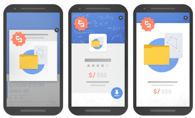
While all three popups may appear well designed (no elements are squished, too small to read, and you can easily dismiss it), Google is worried about the impact they’ll have on user experience by preventing people from immediately accessing content on the site they’re visiting.
Whether you agree or not, having these types of popups load when someone first visits your store will result in your site being pushed down Google rankings and you’ll lose out on organic traffic as a result.

Mobile popup best practices
So it’s important to have a mobile popup on your store to ensure you’re making the most of your website traffic.
At the same time, get your popup wrong and Google will penalize your site.
So how do you go about recreating a mobile friendly popup?
The first step is not to simply duplicate your desktop popup to also show on mobile devices without at least a few changes. The second step is to keep the following points in mind when designing your mobile specific popup.
Choose the right format and trigger condition
The biggest impact user experience and search engine optimization considerations are going to have on your mobile popup is with its format and trigger condition.
Remember, Google doesn’t want you preventing website visitors from accessing content, even momentarily.
This means you shouldn’t have a popup load that takes up anything more than a small proportion of the screen and/or dim the background.
Thankfully, Google actually gives an example of what a non-intrusive popup that loads straight away looks like.

Because the popup is small and doesn’t block the user from accessing content on the page, Google considers it fine from a user experience standpoint to have it load straight away.
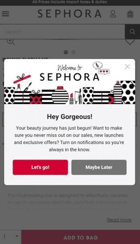
The other option is to go for a more standard popup design like in the example below from Sephora, but not have it load on when a visitor first lands on your site.
To maintain a user-friendly experience and prevent your store from being penalized by Google, you just need to make it either triggered on the second page people visit or after they’ve scrolled down a certain percentage of the page they’ve landed on. You can also achieve this by putting a longer trigger time delay like 20 seconds.
Create your popups with SmartrMail today
? Install SmartrMail and create beautiful popups today ?
Keep it focused and simple
Once you’ve chosen a popup format and trigger that will minimize any disruption to your mobile visitors and will keep Google happy, it’s time to think about the content of your popup.
Remember that you have less screen space to work with on mobile so you’ll want to make sure your popup only contains the most important elements.
That means making your opt-in incentive front and center, including a clear call-to-action button with a contrasting color, and limiting the number of fields people have to fill out to sign up to your email marketing.
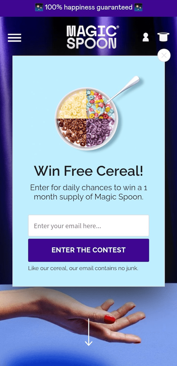
The example below from Magic Spoon is a good example of a mobile popup triggered after someone visits a second page.
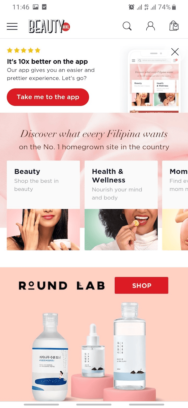
The popup below from BeautyMNL is another good example, this time of one that’s triggered straight away but doesn’t prevent visitors from accessing content.
For more design tips, check out our popup design guide here.
Conclusion
Mobile popups don’t necessarily have to be intrusive or harm your store’s search engine performance.
And while you shouldn’t just duplicate your desktop popup, by creating a dedicated mobile popup you won’t be ignoring half of your customers.
All you need to do is keep the above consideration in mind, as with everything else commerce, always think about the customer experience.
Read summarized version with