
You might not realize it, but a lot hinges on which font for emails you choose to use. Something that to the untrained eye may seem like only minor variations in how characters appear, can actually have a major impact on the look and feel of your email. This can affect everything from whether someone bothers to read your email, to if they actually can read your email.
Pick the wrong font and your entire email marketing campaign is in jeopardy.
So to avoid that happening to you, we’ve created this guide of considerations to take into account for the next time you’re choosing a font. Here we’ll start off with the basics of typography and move right up to some of the more unique considerations.
Serif vs. Sans-Serif Fonts
Perhaps the most basic difference between fonts is whether they’re serif of sans-serif.
So what is a serif? A serif is simply a small line or protrusion at the end of strokes in letters, numbers and other symbols. As for what sans-serif fonts are, “sans” simply means “without”. So a sans-serif font is one without any fancy decorations at the ends of strokes.
In the image below, the A on the left is in a serif font, while the A on the right is in a sans-serif font.

As for which one you should opt for, the general consensus among typographers is that serif fonts work best on printed material, whereas sans-serif fonts make more sense on screens. This is because the resolution of displays are much lower than for print, making serifs harder to discern which decreases readability.
Take a look online and you’ll find sans-serif fonts dominating everything from Google’s search results, to your timeline on Facebook and Wikipedia articles. Open a book and chances are you’ll come across a serif font.
While there will always be exemptions, a good general principle is therefore to stick with sans-serif fonts for your email font.
So now that you understand the most fundamental difference between fonts, the next thing to familiarize yourself with is what fonts work for emails in particular.
Will Your Font Be Viewable by Other People?
Before you go and choose your favourite sans-serif font, it’s best to first know whether other people will be able to view the font on their devices. The reason you need to consider this is because not every device or email client can render every font there is. This is especially problematic for less commonly used fonts.
One of the last things you want is to spend a lot of time selecting a font that fits perfectly with the rest of your email’s aesthetic and branding, only for your subscribers not to be able to view it.
So how do you know if a font can be rendered by other devices and clients? There’s two terms you should be familiar with: email safe fonts and web fonts.
Email Safe Fonts
There’s a small list of fonts that every email client and device from this millennium can display. Because of this, they are the most common fonts you’ll see in not only in emails but on the web in general.
Email safe fonts are:
- Arial / Helvetica (Windows / Mac)
- Verdana
- Tahoma
- Lucida
- Trebuchet
- Times New Roman
- Comic Sans
- Impact
- Courier New
- Palatino Linotype
The problem with these fonts is that being so common, they’ve become incredibly dull and uninspiring. It would be a challenge for even the most talented designer to make an email stand out in people’s inboxes and look great using these fonts.
The email below could do with a more exciting font choice.

Thankfully, web fonts greatly expands the choice of fonts for you to pick from while still being viewable by most email clients and devices out there.
Check out our post on email safe fonts for a more in depth explanation.
Web Fonts in Email
Web fonts are a larger collection of fonts that are supported in most places online, including most of the popular email clients. This means that by choosing a web font, most of your subscribers will be able to view your email the way you intended it.
Here’s a list of the most popular email clients that support web fonts:
- Apple Mail
- iOS Mail (iPhones and iPads)
- Native Android mail app
- Outlook 2000
- Outlook webclient
- AOL Mail
Note that one particularly popular email client is missing from this list: Gmail.
As Gmail is the second most popular email client in the world, does this mean that we’re stuck with the limited number of email safe fonts to use in our emails?
No, there are solutions to being able to use custom fonts in emails.

Fallback Fonts
The most common solution to this problem is to use fallback fonts. These are fonts that get substituted in when a custom font is used which cannot be rendered by an email client or device.
If you send an email with a unique sans-serif font that isn’t available on other people’s devices, their email client will replace it with the closest match from the list of sans-serif fonts that are available. For example, Big Caslon will likely be replaced with a font like Lucida if it cannot be displayed.
This is done automatically so it’s not something you need to set up yourself.
If you decide not to use an email safe font, and especially if you’re not using a web font, you might want to send yourself a copy of the email. If you do this across various inboxes (such as Gmail, Outlook, Apple Mail ect.) you will get a sense of how your email will appear for subscribers. Litmus does this for you automatically across all the different inboxes, however it is a paid service.
Aesthetics of Fonts
Now that you’re aware of all the major technical considerations when choosing an email, it’s time to consider the aesthetics of fonts.
Not only do you want a font that will render on people’s displays accurately, but also one where the design matches the feeling and image you want to project.
If you already have a font you use in your branding elsewhere, best practice is to just use this font in your marketing emails. Especially if the font bodes well with the above points. If not, such as if you use a serif font for your branding, you will have to determine whether it’s better to maintain brand consistency or if you’re better off following email font principles.
Tiffany & Co. is an example of a well known brand that uses a serif font throughout its marketing. They have decided to carry this across to their email marketing materials to maintain brand consistency.
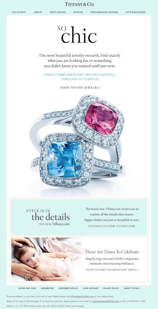
This doesn’t mean that you should just copy over whatever font you use in your logo to your email however. Many fonts used for brand logo are custom and complete unsuitable to use in anything apart from the logo itself. Just think of the Disney logo and imagine how unreadable their emails would be if all the text was in the cursive handwritten style.
If your brand doesn’t have a font associated with it that lends itself well to use in emails, then you’ll have to pick a font based on what kind of vibe you want your email to give.
Professional Fonts
Opting for a professional or neutral feel in your email makes font selection relatively easy as most fonts, especially web fonts, are designed to do this.
Arial and Helvetica are popular sans serif fonts to convey this. However their commonness on the web makes them a dull choice. Instead opt for a more fresh and modern alternative such as Helvetica Neue, or better yet, Avenir or Gill Sans. If you’re wanting a serif font, then Baskerville provides a better alternative to the tired email safe serif fonts.
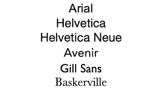
While not available on all devices or email clients, these fonts should always fallback to either Arial or Helvetica if they cannot be displayed. Baskerville will fallback to one of the other serif fonts.
Warm & Friendly Fonts
If you would rather convey a more personal touch in your emails, then your choice is generally harder. The best way to go about this is to go through a list of fonts with a service such as Font Picker and see which one think works best.
There is one font you should always avoid using: Comic Sans.
Comic Sans has a special reputation where people who use it are ridiculed online for being amateurish. This is probably one of the last impressions you want to give people about your business.
That is not to say that there isn’t a legitimate use case for handwritten style fonts. If it makes sense for your brand, such as if you’re selling children’s toys, then by all means go for it. It’s just better to use a font other than Comic Sans.
Sign-up to our newsletter and receive a free eBook with hidden Email Marketing Tips
Other Considerations
While the above covers most situations, there are a few more, smaller considerations to keep in mind when it comes to choosing a font to use in your email.
Number of Fonts
Sometimes you might want to use more than one font in your email. While in general it’s often a good idea to stick to a single font for consistency, you can usually get away with an additional font.
The email below from Armani uses two different fonts well.

The most likely reason they used two fonts in their email is because of their logo.
Like with Tiffany & Co., Armani is a popular brand that uses a serif font in their logo. It’s likely they wanted to use this serif font for the thank you header to reinforce their branding, but then switched to a more legible sans-serif font for the body text for readability.
Although there are perfectly good reasons to use two fonts, it’s best to avoid using three or more unless under exceptional circumstances.
Other Characters
When typographers design a new font, they need to create designs for each and every letter, number, and symbol they want included.
If you’re only using the 26 letters in the English alphabet, this is hardly ever something you need to be concerned with. However, if you’ve opted for a unique font and are using characters that aren’t used in English, this is something you should double check. Even accents marks (diacritics) added to letters such as with ä and é may not be present in certain custom fonts.
The less common the font and character, the more likely the character won’t be included and will be substituted with a fallback font.

For instance, the custom font ‘Instaburger’ doesn’t support the German ‘ß’ character. In the example above it has been replaced with a fallback font.
Once You Have Selected a Font
Once you have determined which font you think works best for your email marketing, stick with it. Make it your default font and add it to your email templates.
Constantly changing your font fails to maintain consistency and will end up damaging how your email subscribers perceive your brand. Keep changes to an absolute minimum and only do so if you’re absolutely sure it’s essential.
Now that you’ve got your font chosen, it’s time to design the rest of your email.
Read summarized version with