Sending browse abandonment emails is one of the easiest and most effective ways to increase sales. We have selected some of the best browse abandonment email examples below.
Like their cart abandonment email sibling, browse abandonment emails target potential customers right at the very moment they show purchase intent.
This combination of email segmentation and personalization is what makes them one of the highest-performing automations you can incorporate into your email marketing strategy.
When compared to regular emails, browse abandonment campaigns:
- Receive an 80% higher open rate
- Have a 50% higher click-through rate
- And over 10% of customers who click on an email will go on to make a purchase
But not all browse abandonment emails are created equally.
So to help you when composing your own, we’ve put together this list of our favorite browse abandonment email examples.
This list will give you an idea of what you should be aiming for with your own campaigns as well as provide plenty of inspiration.
The best examples of browse abandonment emails
1) Timberland
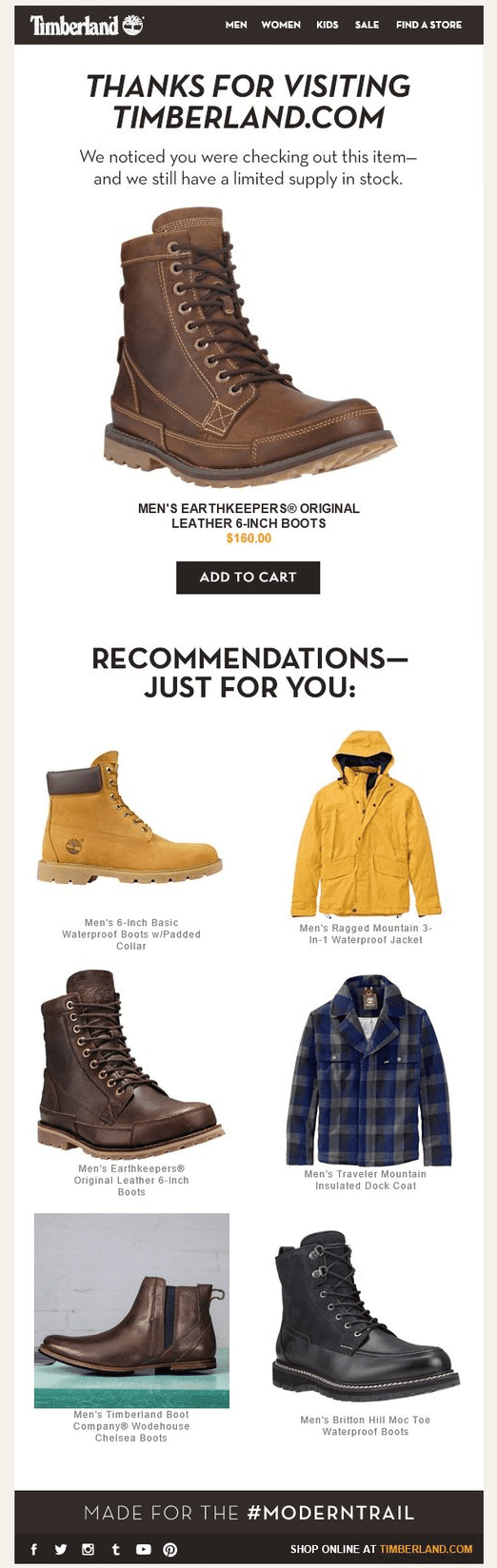
First up is this typical but well-executed browse abandonment email from Timberland.
This is a typical example because it includes all the main elements browse abandonment emails typically contain:
- An image of the specific product abandoned
- A link to add it to your cart
- Product recommendations in case the original product isn’t suitable
If you’re struggling to think of what to include in your own emails, these three elements are a great starting point.
Beyond that, Timberland’s email is a great example as it’s been executed well with high-quality product imagery and a simple clean email design.
2) Humanscale
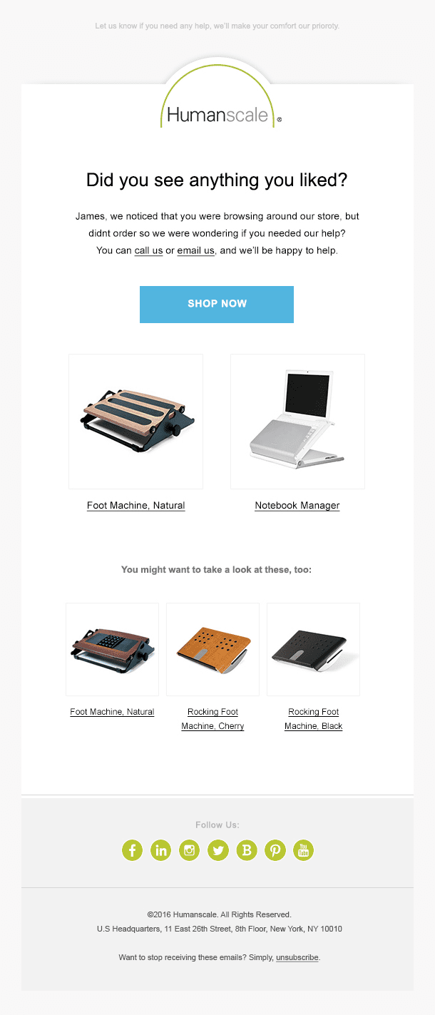
This is another example of a nice and clean browse abandonment email design.
Like Timberland’s campaign, this one also includes high-quality product images as well as some product recommendations.
However, instead of encouraging the potential customer to add the products to their cart and checkout, this example takes a step back.
They do this by simply asking if the customer needs any help deciding and then letting them know they can call or email through any questions they may have.
This represents a more light-touch approach that avoids the email coming across as too pushy.
Try our Browse Abandonment feature in your free trial
? Use our free trial to test all our features!?
3) Asos
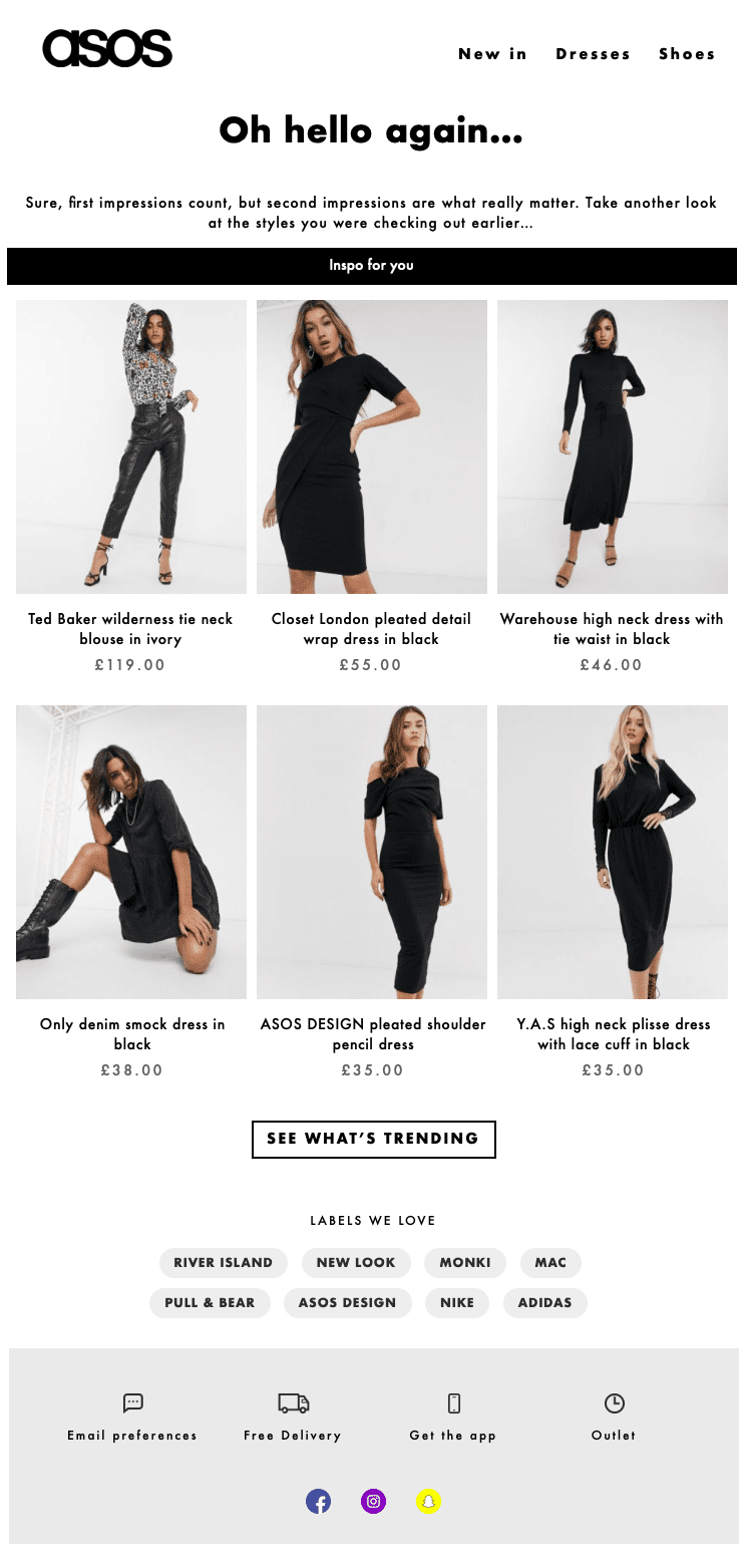
Instead of encouraging customers to come back and purchase the product they were viewing, or even ask whether the customer had any questions, Asos’ email simply encourages people to have a second look.
Often this subtle suggestion can be enough to trigger a sale and certainly won’t come across as too pushy.
It’s all about just keeping your brand, and more specifically your products, front-of-mind.
4) Smartwool
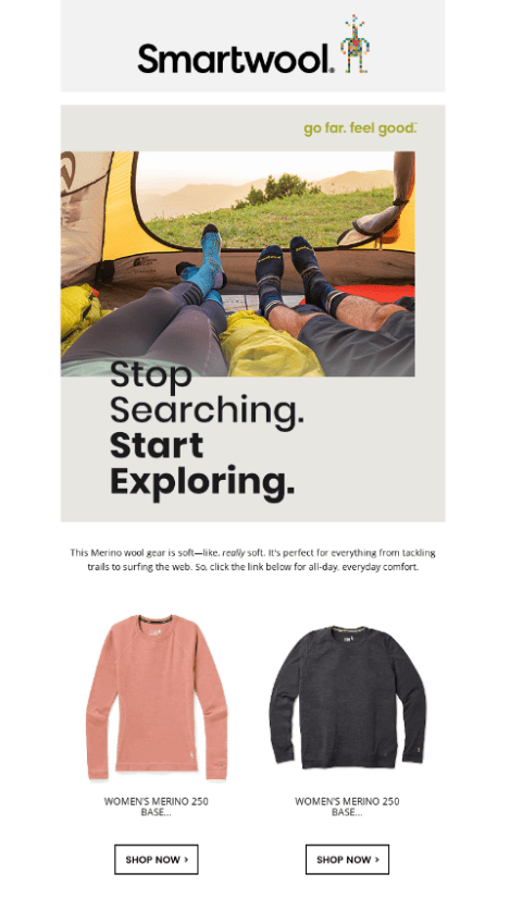
This example from Smartwool doesn’t even look like a browse abandonment email at first glance.
The heading “Stop Searching. Start Exploring.” is what gives this email away and makes it such a great example of a browse abandonment strategy.
This is because instead of being along the lines of “we saw you viewed this product, now come back and purchase it” Smartwools is being much more subtle. From the customer’s perspective, this would likely just seem like a well-timed email and nothing more.
5) Danner
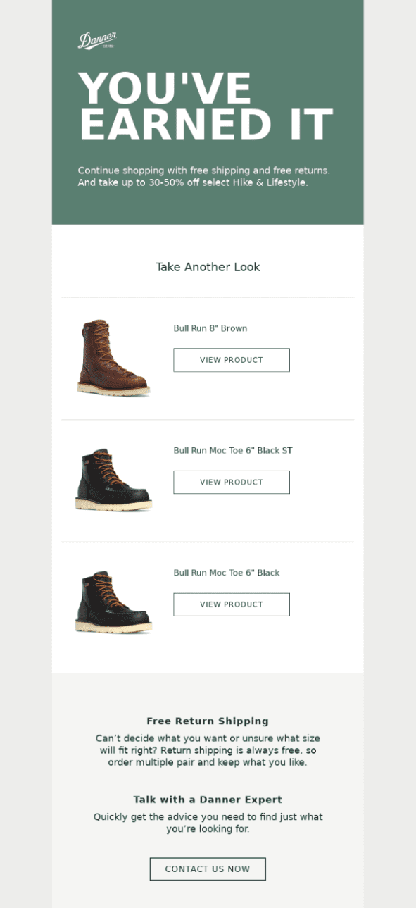
This example from Danner makes no attempt to hide the fact that it’s a browse abandonment email but it does take a slightly different approach by including an offer.
While the offer is quite hard to notice in the body of the email, the heading “You’ve earned it” encourages customers to treat themselves. The offer then gives them a way to easily justify the purchase.
For good measure, there is also a link at the bottom where potential customers can “talk with a Danner expert” in case they have any questions holding them back from making a purchase.
6) Amour Vert
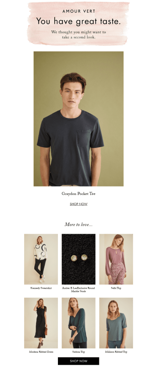
Another simple and beautifully designed browse abandonment email. This one from Amour Vert compliments the browse abandoner by saying that they have great taste.
Complimenting customers like this is a very common strategy brands will use in their browse abandonment emails.
The only issue with this particular example is that the product recommendations at the end bare little in common with the product that was abandoned.
Sign-up to our newsletter and receive a free eBook with hidden Email Marketing Tips
7) Browse abandonment email example from Amazon
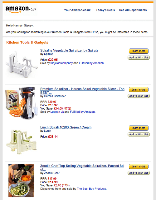
Amazon is one of the best brands in the world when it comes to killer email marketing strategies. So we only thought it was only right to include one of their browse abandonment emails on this list.
While the design isn’t anything to rave about, what you will notice is that instead of reminding people about a specific product they viewed, the email just provides examples of other products in the same product category.
By also including some of your best-sellers from the product category people viewed, you’ll increase the chances of them seeing something they like. Even if the product they originally viewed doesn’t fit their needs.
8) Aerosoles
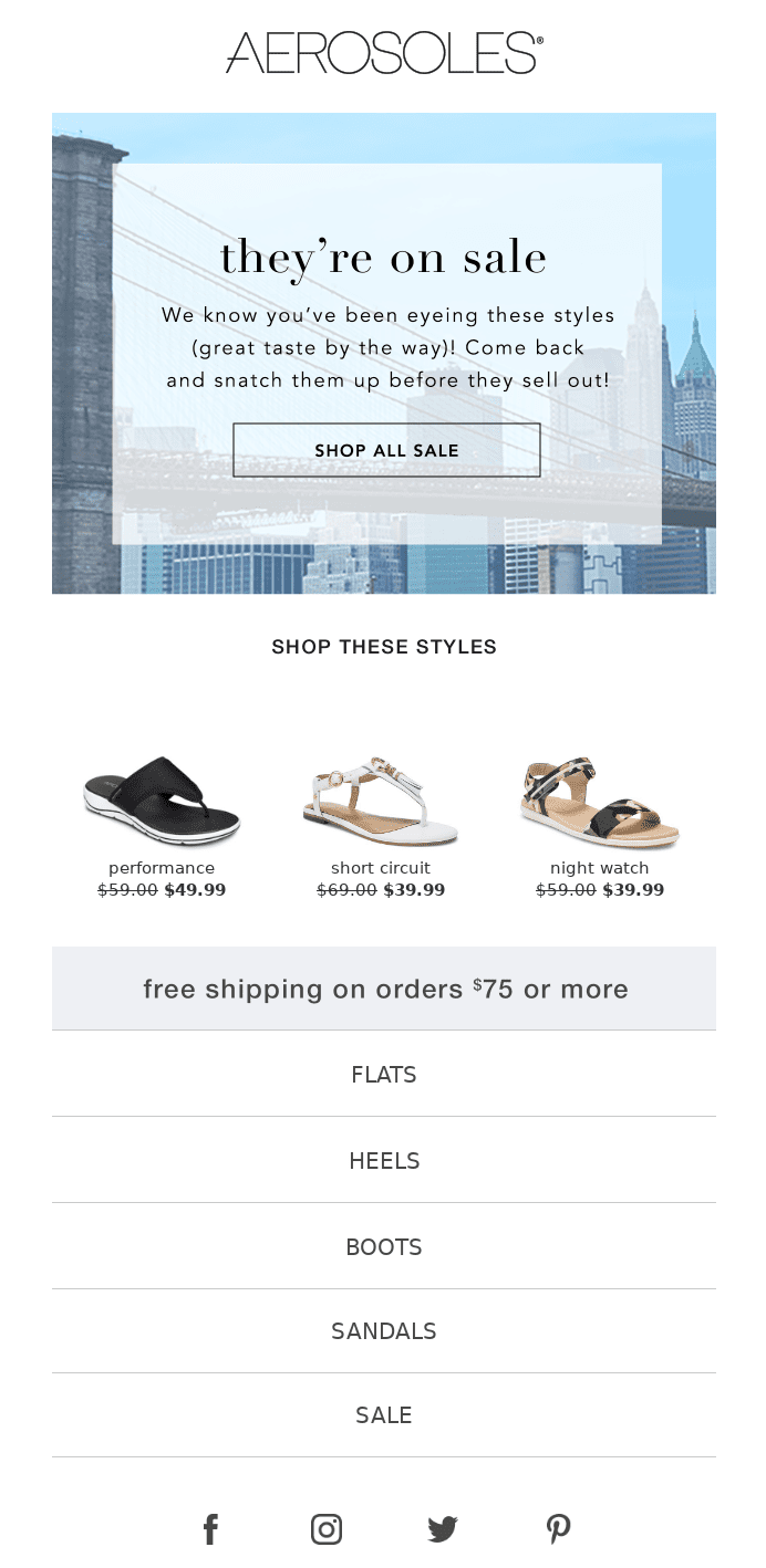
This example from Aerosoles is a combination of a browse abandonment email and a sale email. This two-pronged approach is sure to make this email quite enticing.
Obviously including a sale offer will help improve the conversion rate of your browse abandonment campaigns. But that doesn’t mean you necessarily need to include one.
Typically you’ll want to send two browse abandonment emails: one straight after someone abandons the product and another roughly a day later if the first one didn’t work.
To avoid giving away too much margin, a good idea is to keep any offers to only this follow-up email.
9) Loeffler Randall
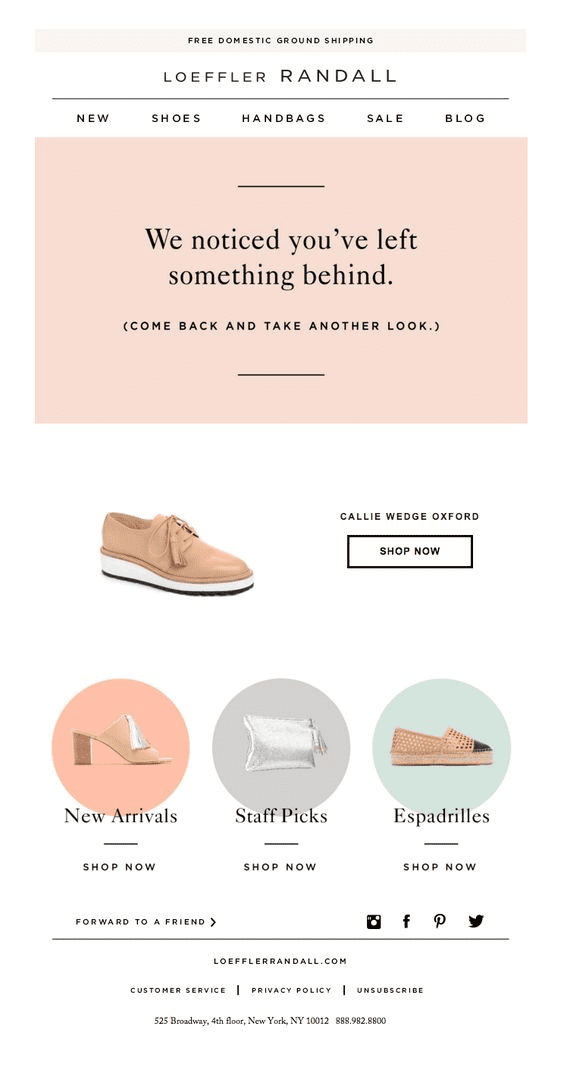
Another simple and clean email design, this browse abandonment example from Loeffler Randall is well and truly on-brand.
In addition to including the specific product their customer was looking at, they’ve also included links to product collections.
This works similar to including personalized product recommendations by providing more options to choose from in case the original product isn’t suitable. Something you can consider doing as well.

10) Michael Stars
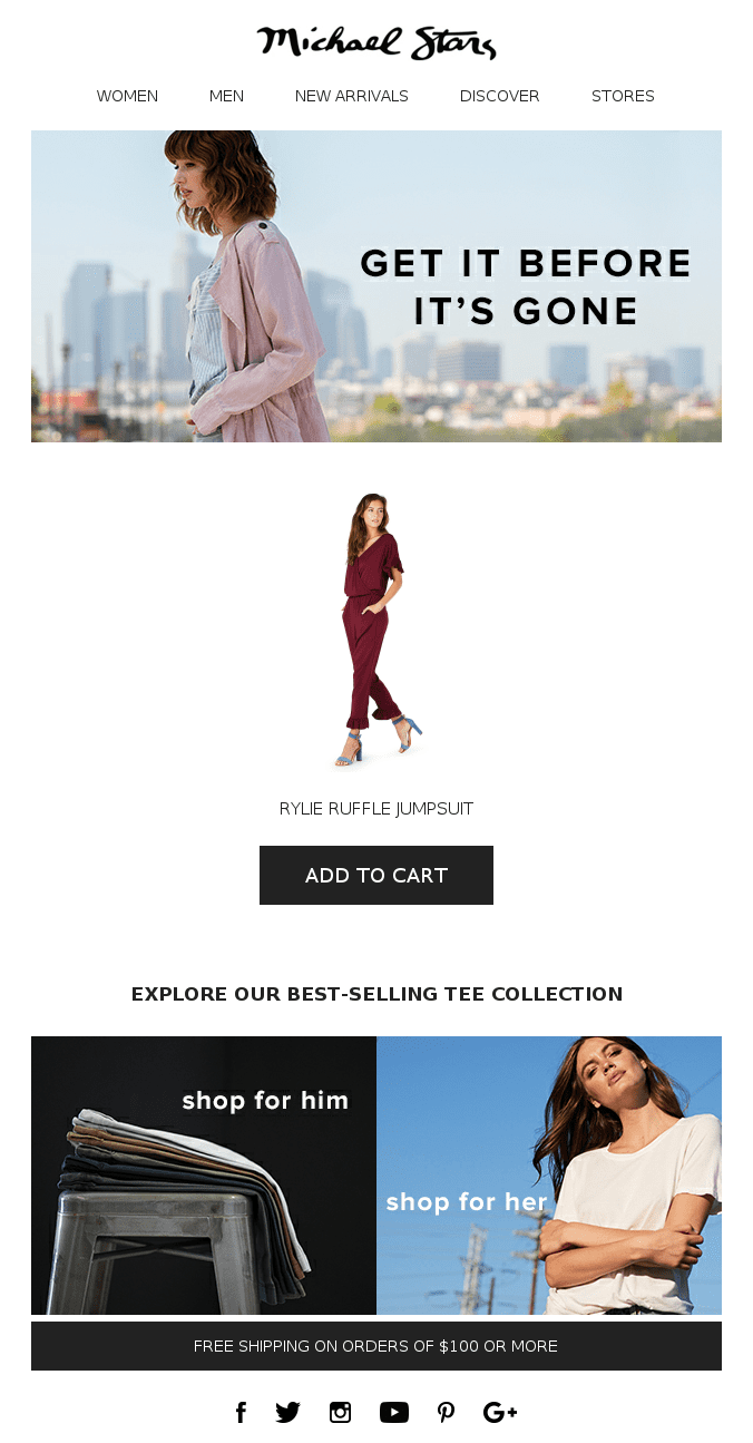
This browse abandonment email example from Michael Stars plays on people’s fear-of-missing-out (or FOMO) with copy such as “Get it before it’s gone”.
This is a strategy definitely worth experimenting with in your own campaigns to see whether it can improve your conversion rate.
The other noteworthy thing about this example is how the call-to-action (CTA) button is ‘add to cart’ instead of ‘shop now’ or ‘view product’.
By clicking people to a shopping cart with the product already added, you reduce the number of steps needed for them to make a purchase than if you simply linked them to the product page. This is another way you can improve your conversion rate.
The bottom line
Hopefully now you have a good idea of what typically goes into a browse abandonment email from these examples.
For a more detailed guide, check out our post on browse abandonment email strategy here which dives deeper into best practices and how you should structure your campaigns.
Of course, you’ll also want to give your emails enticing subject lines to improve your open rates. And to help with that, we’ve also put together a list of browse abandonment subject lines here you can look at for inspiration.
Lastly, if you want to know how to set up browse abandonment emails in SmartrMail, you can view our step-by-step guide here.
Read summarized version with