
When it comes to designing e-commerce emails that convert, you no longer need to be a wizard at Photoshop or spend hours touching up an email to make it look visually appealing.
All you need to do is follow a few best practice tips to see an uptick in sales, open rates, and average order frequency.
If you’re looking to improve the design of your emails or have overlooked email design altogether, in the next 3 minutes and 45 seconds, you’re going to learn how to structure and design e-commerce emails to drive revenue.
Three-Point Email Strategy
Before I talk about the micro design elements of e-commerce emails, you must first learn the philosophy behind successful sales emails.
Every good e-commerce email leads the recipient through a journey that is broken down into three parts: the BIG statement, the convincer, and the call to action.
BIG statement – This is the call out message to your audience. It’s usually at the top of your email or in the subject line and informs the subscriber in a few seconds what the email is about.
The BIG statement can only truly be BIG and make an impact if your email list is segmented. If your statement resonates with the subscriber, they will then go on to the second part of your email. If it doesn’t, they will go away.
Personalization is key to step 1.
Convincer – This is the part of the email where you display the value proposition of your product or service.
This carries on the story of your BIG statement with content such as video, images, or text. The convincer is typically in the middle of your email and takes up the most amount of space.
Call to action – The conclusion of each email should provide the subscriber with an action to take. Whether that action is to view an item in your store, fill out a survey, or read a blog post, it’s at the end of the email where you directly call on the subscriber to make an action.
Call to action: a marketing word to describe a button on a website/email that users press to be sent somewhere.
This three-point strategy can be used for almost all email types, from product recommendations, to upsells, to win-back emails.
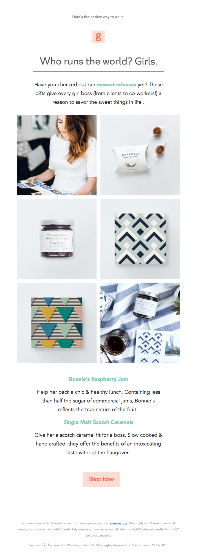
Here’s a sales email from Greetabl that uses the three-point email strategy:
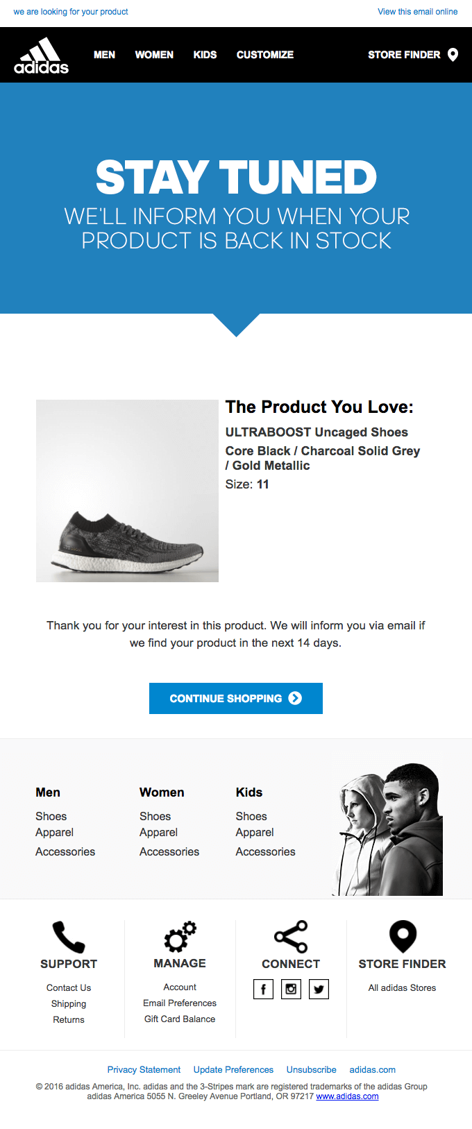
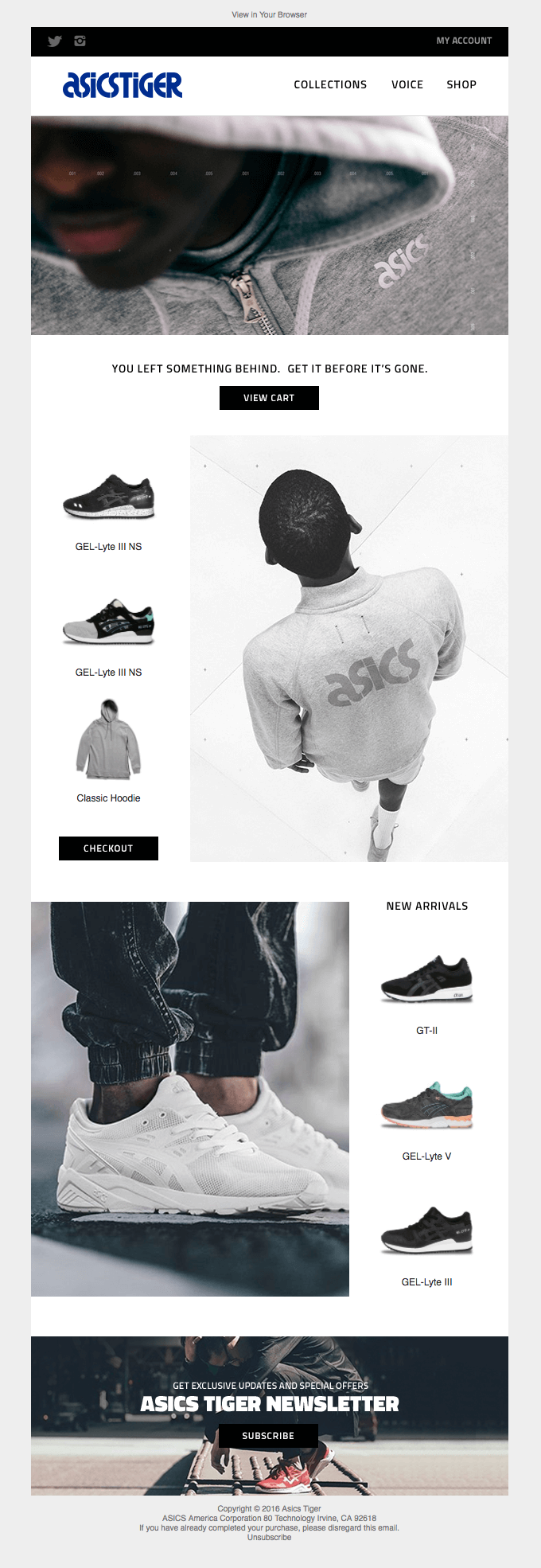
Adidas use the same three-point strategy for their abandoned cart email:
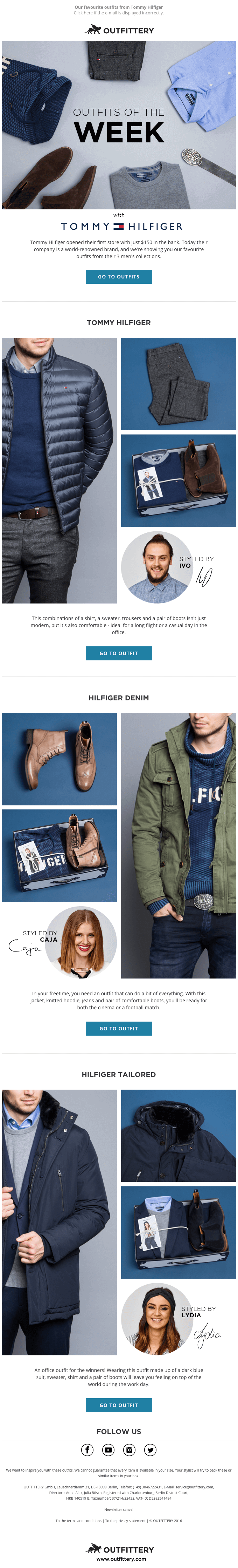
The call to action can be inserted in your email a number of times. Some e-commerce emails will place the call to action at the top and in the middle of the email, as well as a button to give subscribers multiple chances to click through, as you can see with this Outfittery email:
For the most part, your subscribers are on auto pilot when reading your emails, and are likely to be multi-tasking and doing other things, like listening to music, waiting for a friend to reply on WhatsApp, or watching TV.
The BIG statement snaps them out of zombie mode, the convincer lays out the value to be had, and the call to action gives them a clear decision to make next.
This is how you should format every email you send.
Now I’ll go into the micro elements of email design that will help you to:
- avoid spam filters,
- increase click-throughs,
- improve branding, and
- generate more sales.

1. Correctly formatting your email footer
When was the last time you ever read the footer of an e-commerce email?
An email footer is like the terms and conditions when you join a new website…

Nobody reads it.
Your subscribers may not be reading your footer, but every Internet Service Provider (ISP) is. Include your business’ physical address and unsubscribe links in the footer to comply with CAN-Spam laws to improve your email deliverability.
The more information you list about your business, the better.
Links to social media profiles are also common in the footer of emails, but should you include big bold buttons and images?

Nah.
Each email you send out is intended to get the subscriber to make a specific action. If your main goal isn’t to gain social followers, you shouldn’t dedicate a significant amount of email real estate to your social links.
Brands include social media links for the sake of it because every other company is doing it, but if you go over your email history and see how many link clicks you receive from your social media icons. I bet it’s not that many.
I’d only include large and visible social media links on emails where the main focus of your email is to connect with your subscriber on social. This could be a welcome email, where you use social to tell your brand’s story – or a post purchase email, where you encourage your customer to share their purchase on social.
2. Colors, font, and email structure
Your email template should look and feel like your website.
Each email should be in your brand colors and use the same typography as your website. Your logo and menu placement within emails should correlate with your website to keep your marketing scent familiar.
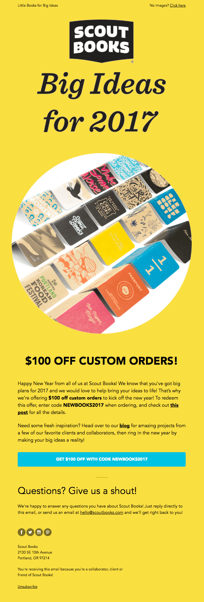
Here’s an email from Scout Books:
Here’s their website homepage:
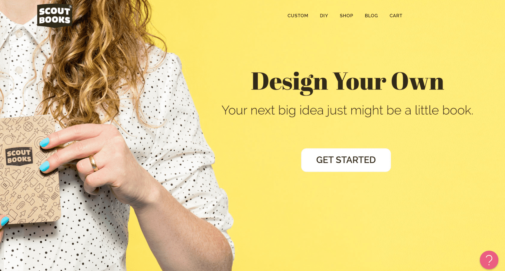
The font, colors, and overall design is very similar.
When your call to action is to get people to visit your website, ensure the design of your email matches the page you’re directing them to as that helps provide a consistent user experience across various platforms.
Your emails will also look a lot less spammy if you follow these guidelines.
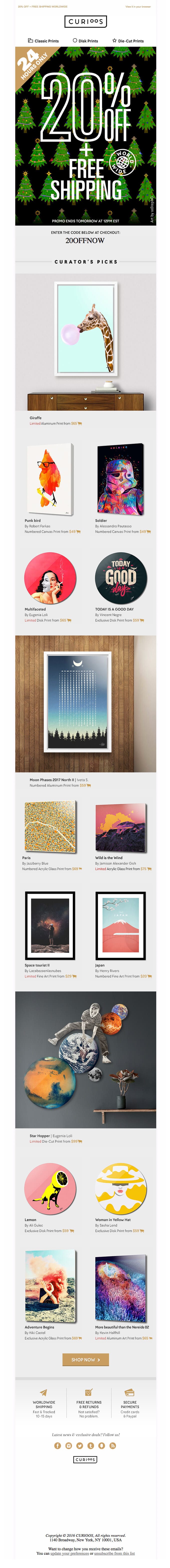
If the webpage you’re sending them to has a menu, be sure to include your menu in your email too, like Curioos:
Their website:
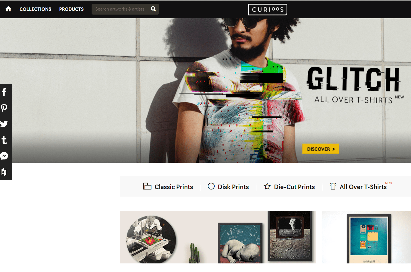
As a rule of thumb, your email header should look very similar, if not identical, to your website header.
There are a few exceptions where you can disregard the information above – typically for holiday campaigns, such as Christmas or Halloween, where you might use holiday colors over your brand.
For example, if you’re sending a Halloween campaign, you might use the colors orange and black. If so, temporarily change the colors on your website during the campaign to keep the same marketing scent.
3. How to correctly place your calls to action
There’s a lot of debate on where you should place your call to action. Most often, you’ll see them at the bottom of emails, but they are also placed in the middle (see the Outfittery example above), and sometimes even above the fold of an email.
Figuring out where to place your call to action is actually very easy when you answer the following two questions:
- Am I serving content to prospects or customers?
- Has the subscriber consumed the BIG statement and convincer?
A prospect is someone who has yet to make a transaction with your business. Chances are that they don’t fully trust your business yet (hence they are a prospect) and may not fully understand your product or service.
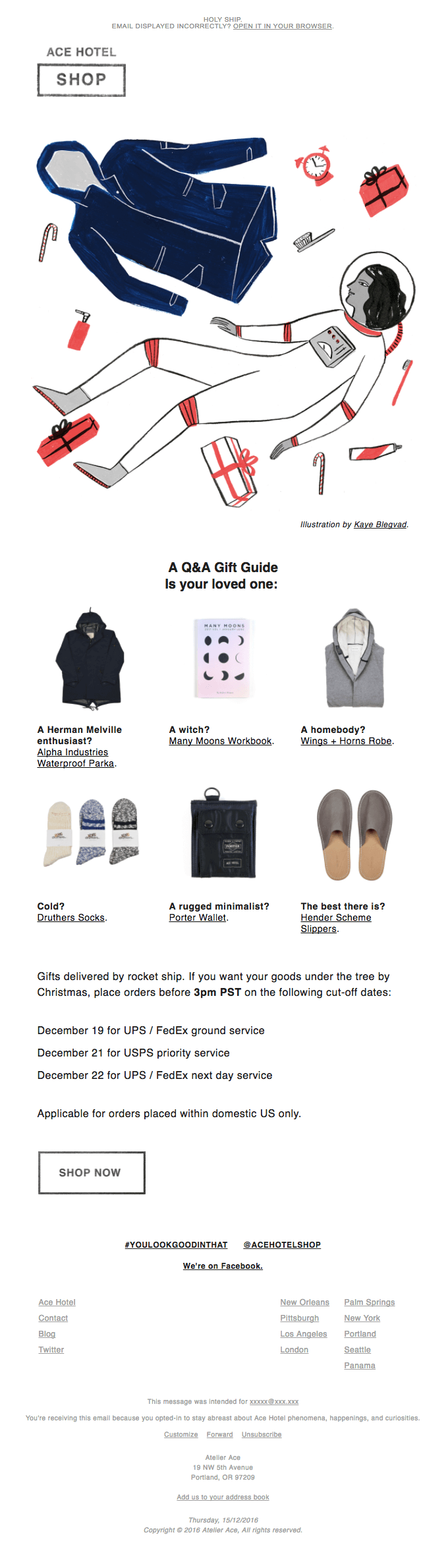
Generally speaking, you’ll need to provide a prospect with more content (convincer) before you ask them to take action. For this reason you should never place your call to action above the fold (like Ace Hotel) when serving content to prospects.
If you’re serving customers, you can get away with placing a call to action at the top of your email, but I strongly suggest they consume the BIG statement and convincer before being asked to click a button.
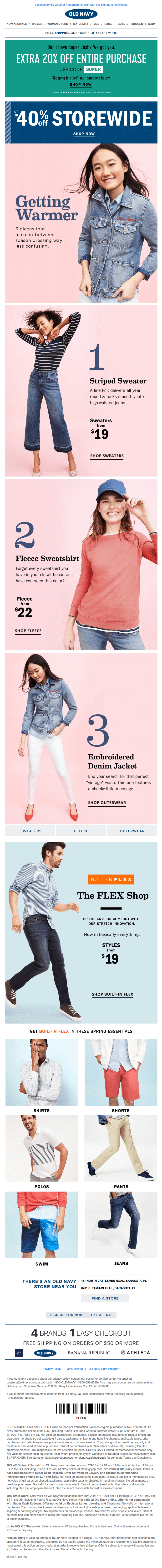
Old Navy place their call to action at the top of their email, but before doing so, they lay out their BIG statement and convincer.
When I design e-commerce emails for clients, I’ll always put my call to action in a position where the subscriber will see it only after reading the BIG statement and convincer.
This ensures that each click through is targeted and of a higher quality. By fully explaining to them what they can expect if they click the button, it pre-frames them when they land on the product page.
Yes, you may receive higher click-through rates if you place your button above everything else, but your conversion rate will be much lower because subscribers don’t know what to expect after clicking.
Sign-up to our newsletter and receive a free eBook with hidden Email Marketing Tips
4. Picking your imagery
Before I go into the types of images to use in your emails, let me tell you what you shouldn’t use: stock images.

With an ever increasing number of startups with limited budgets, stock images will end up ruining your brand’s credibility as subscribers may have seen the images you’re using on another website.
You don’t want to give your email list any reason to distrust you – they are only one click away from marking your emails as spam or unsubscribing.
If you can, use the following image types:
Models – Put on your TV and force yourself to sit through a few minutes of adverts and you’ll notice one thing: every clip contains models.
You don’t need to pay thousands of dollars nowadays to hire a model. You can ask your employees to model for you and use your products.
Photoshop can make anyone look dashing – trust me, I use it all the time for my Tinder profile. 
Using human beings in your marketing has been proven over and over again to increase conversion rates.
Your subscribers need a second opinion before they buy something. If they see models in your images wearing, using, or having a good time with your products, they then see themselves in the same way.
When creating your visual content for emails, make sure they are situational images (i.e. they are used in context). For example, if you’re selling sporting equipment, make sure your models are outdoors playing sports to get your message across more strongly.
You know what works even better than models? Cats and dogs.
No really, loveable animals also make great actors and humanize your brand.
Abstract shots are often used when you’re showing an individual product. These photos are easier to take because no humans are needed, and they are much easier to edit.
They only need to be of high quality and behind a neutral background like so:
By testing various images to see which type of creatives your customers resonate with best, you can combine both sets of images together too.
5. Make sure your emails make sense with no images
One of the biggest mistakes design skilled marketers will make is creating their entire email in photoshop and pasting it into their ESP.
Some spam filters will pick up emails that are images only. On top of that, many subscribers will not be shown to users without their permission.
Therefore, it’s best to incorporate text and buttons (ideally the BIG statement and call to action) alongside your images to increase readability and make it through spam filters. This is best illustrated by Amazon:
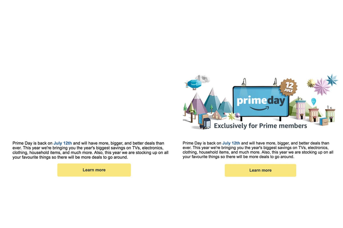
While Amazon’s balance of images, text and buttons is perfect. They could improve by adding alt text to their images – which will increase their email deliverability by making image context readable by ISPs like Gmail.
Tip: Give your subscribers the option to view the email in their browser. Put this in the header of your email to minimize the chances of HTML elements becoming blocked.
6. Test for mobile first
I should have put this at the top of the article, as it’s probably the most important factor to e-commerce email design, but it’s almost common knowledge and automatically optimized in SmartrMail, so I left it for last and I’ll keep it short.
Over half of all emails are opened on a mobile device, so your emails must be mobile responsive. When testing emails, review them on various mobile and tablet devices to ensure they load and render correctly.
Most marketers have a habit of sending a test email that they open on their desktop computer. A badly coded email can look fine on desktop, but may not align correctly on mobile.
Your turn
Like I said at the start of the article, you don’t need to be a Photoshop wizard to create beautiful or high-converting e-commerce emails.
SmartrMail makes the email design process as easy as possible. Your email template only requires a one time setup and our drag & drop composer helps you create emails 5x faster than you would in MailChimp.
How much thought have you put into your e-commerce emails? Do they follow the three-point strategy I listed above?
Simple tweaks and adjustments can drastically increase your sales if you have never optimized the layout and design of your emails.
Read summarized version with