Did you know that 69% of customers who make it all the way to your checkout, will drop off and abandon their purchase?
Having so many customers come so close to making a purchase can feel like a kick in the guts to store owners after all the work they’ve put in getting people so far. But it doesn’t have to be this way. The 69% figure is just a global average, by optimizing your Shopify checkout you’ll be able to increase conversions and reduce cart abandonment.
In this guide, we’ll show you how you create the best checkout flow to ensure that as many people as possible convert into paying customers.
A Recap on Shopping Cart Abandonment
Before we dive into how to optimize your Shopify checkout process, it’s worthwhile quickly recapping the main reasons customers abandon their carts in the first place. We’ve written another post into these reasons and what you can do about them, but in a nutshell the top five reasons, in order, are:
- Unexpected shipping costs or conditions at checkout
- People browsing for a better price elsewhere
- Having to create an account to checkout
- Preferred payment option was not available
- People simply getting distracted and forgetting about their cart
This gives you an idea of how to best structure your ecommerce checkout process. Essentially, you want to design your checkout so that you steer your customers away from falling for any of the above reasons. So let’s get into some ways you can achieve this.
Get Rid of Customer Accounts
Not being able to checkout as a guest is one of the biggest factors holding back your checkout conversion rate. While this shows why it’s critical you offer guest checkout, it’s better to get rid of the option to sign into a customer account during checkout altogether. Why? Because simply just asking the question is jarring:
Do you have an account with us or is this your first purchase? Create an account here. Don’t remember your account details? Click here to reset your password. Click here to be sent your username.
The question adds a completely unnecessary step that just acts as another hurdle to conversion.
If it’s the customer’s first purchase, you’re asking them to decide whether to go through an entire extra process of setting up an account with a username and password that dramatically increases the length and complexity of your checkout process. For returning customers who don’t have access to their password, you’re asking them to decide between the painstaking process of resetting one’s password or to feel like they’re missing out on some extra perks.
In fact, simply by removing this question, one online retailer saw a massive increase in sales by $300 million! If you’re still not convinced, just take a look at how intrusive the question is on the checkout page below:
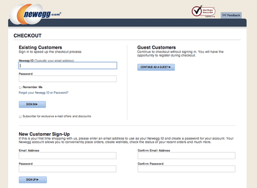
A decent amount of reading is needed required just to know which form to fill out and which button to click on next to continue check.
So it’s better just to keep your checkout as streamlined and simple as possible by not asking the question at all. Instead you can simply use people’s email addresses to keep track of what purchases they make for any loyalty programs or other purposes you use customer accounts for.
If, for some other reason, you simply must have the option during your checkout, only present the option if you already know someone has an account. With a bit of programming, you can setup your checkout to recognize if someone already has an account based on their email address. For new customers, you can then give them the option to create an account after they complete the purchase.

Keep the Number of Steps to a Minimum
Following the same logic as not asking people whether they have an account with your Shopify store or not, it’s best practice to keep the number of steps to checkout as small as possible.
The easier and quicker it is for people to complete their purchase, the fewer opportunities there are for people to drop off during the process. Seeing as customers getting distracted and forgetting to complete their transaction is a leading cause of cart abandonment, this should be a priority.
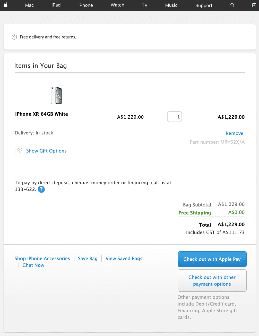
A few ways to make your checkout more streamlined include giving customers the option of copying their shipping address to use as their billing address and keeping the number of checkout pages to a minimum. Apple, a world leader in marketing and customer experience, exemplifies this with their single page checkout.
You can also provide a visual progress bar showing people how close they are to finalizing the transaction. This helps to create a sense of being in control of the process for the customer and, if your checkout process is optimized well, shows how close they are to completing the steps.
Keep Your Checkout Experience Consistent
After a customer has decided to make a purchase, you want to ensure that their journey to completing the transaction is as seamless as possible.
Even the smallest of changes between your store and checkout can be jarring to customers. Whether it’s a different color scheme or the use of different fonts, any sense of discontinuity interrupts the customer and risks them getting distracted or changing their mind.
There’s also no reason why you’d give your Shopify checkout a different design aesthetic, so to maximize your conversions, keep it as consistent as you can.
Always Put Your Customer First
In addition to minimizing the number of steps required to make a purchase, you also want to ensure that all you layout the questions in a way that is customer centric.
Even though most Shopify stores do a good job of making sure that they place the customer’s needs and desires first with their store’s experience, they fall down when it comes to their checkouts. Whether it’s the temptation of finally making a sale, or just sloppiness, all-too-often checkouts prioritize profit making over the customer’s experience.
Once example of this is asking for a customer’s billing information first. Even though this might seem trivial, asking for other things such as their shipping address first subconsciously reassures the customer that you’re putting their needs first. Just compare Amiclubwear’s checkout below:
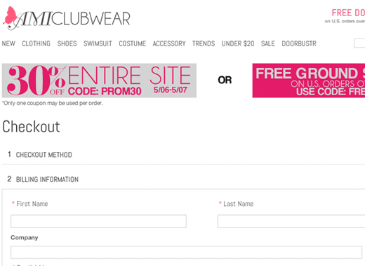
To that of Target’s:
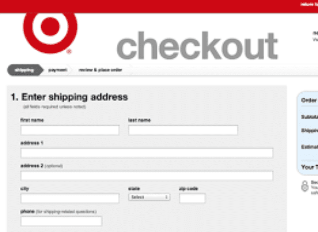
By comparing these two checkout pages, it becomes obvious which one places more emphasis on their profit margins and which one makes the customer feel more valued.
Sign-up to our newsletter and receive a free eBook with hidden Email Marketing Tips
Make Sure It’s Easy to Checkout
It might seem obvious, but you don’t want to have people abandoning their carts because they find your checkout pages too confusing.
This means that your form fields should be labelled well so people know what information to enter and where, checkout buttons contrast with the background so they stand out and that people can see an order summary so they know exactly what they’re ordering. It’s also worth giving your customers a means to reach you, whether it’s an email address or phone number, so they have a way of contacting you if they run into trouble.
In case it hasn’t sunk in yet, the most important thing you can do to improve your Shopify cart checkout conversions is to make the process as simple and seamless as you possibly can.
Don’t Skimp on the Fundamentals
In addition to streamlining the checkout process, you should also make sure that you have all the fundamentals of a good Shopify cart checkout. By going back over the top reasons for shopping cart abandonment, this means:
- Offering plenty of payment methods for customers, not just one or two different types of credit cards
- There are clear call to actions pointing people to the next stage of cart checkout
- Make sure you’re using encryption to process orders and that you’re compliant with the latest online security standards (Shopify’s cart checkout option makes this easy)
- There are no expected conditions or extra charges; make sure the full prices are clear on the product pages
- If possible, you’re also offering free shipping for items on your Shopify store, that way you avoid shocking shipping costs
Over to You
Cart checkout abandonment is frustrating, but by implementing these suggestions and recommendations, you can rest assured that you’re actively working to reduce the rate. Even the most optimized checkout will still see people dropping off during the process. These people are what abandoned cart emails are for – reminding them of their cart and enticing them to complete their purchase.
Read summarized version with