Email marketing is the most effective way to get more sales for your store.
That said, you can create the best email campaign of all-time and it won’t drive a single sale if there’s no-one on your email list to receive it.
This is why it’s important to start growing your email list as soon as possible. And one of the best ways to capture emails is with popups.
While some merchants are hesitant to run popups on their store out of fear they’ll annoy customers, study after study consistently shows that popups improve conversion rates and lead to more sales.
And when you run a beautifully designed, eye-catching popup that’s set up to minimize the disruption for people browsing your store, you won’t have to worry about annoying anyone.
So, with that in mind and the goal of improving the performance of your online store, here is a collection of 10 of the best email popups we’ve seen to inspire your own.
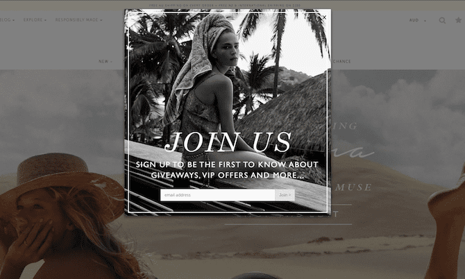
1) Gaiam
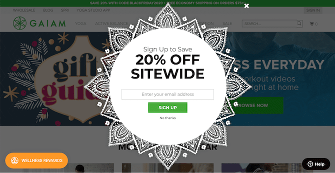
Right off the bat is a popup that grabs your attention with its unusual and unique shape.
In addition to attracting visitors’ attention, the pattern around the edge aligns perfectly with Gaiam’s brand and gives off a feel-good vibe.
Even though it might look like a hard design to replicate, it’s actually quite easy to do. All the popup is is a square image that’s in the PNG format so it supports transparency around the edges.
While the content of the popup is rather ordinary in comparison with black text on a white background and a generic ‘sign up’ button, all the essential elements are present: an incentive that makes it worth signing up, a simple and quick form to complete, and an easy way to dismiss the popup.
What would take this popup to the next level is some more creative copywriting, especially with the call-to-action. Even something simple like ‘grab your coupon’ is much more engaging than the dry ‘sign up’.
2) Monoset
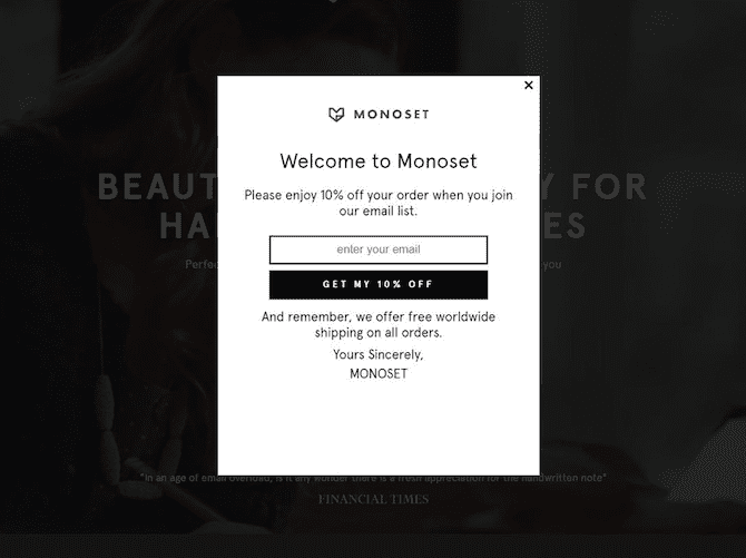
This is your textbook popup example: rectangular with a logo, title, message, email input field, and a button with a call-to-action. And while this example is not as eye-catching as Gaiam’s popup, it shows how a simple design with a clear and unique message can be effective.
Where this popup performs significantly better than Gaiam’s above is with it’s more engaging copywriting. Welcoming shoppers, inviting them to ‘please enjoy’, and reiterating the offer in the call-to-action button all improve the popup’s effectiveness.
The other great thing about this popup is that Monoset is making the most of their visitors’ attention by reminding them about their free worldwide shipping as well.
3) Lindsay Letters
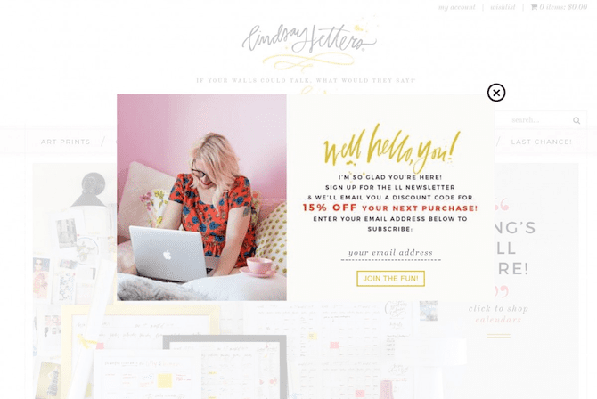
Lindsay Letters’ popup is a warm and playful example. This is conveyed in the use of color, font choice, and copywriting. Even the email field looks casual and friendly with italicized text and just a dotted line at the bottom.
While the message is longer than what most popups contain, attention is still drawn to the offer through the use of bold text and different color.
Most importantly, the popup matches the vibe of the website and is not a dull, generic popup that customers will just want to dismiss as quickly as possible. Most are actually going to want to read this one and hopefully sign up for their email newsletter.
4) The Dog Bakery
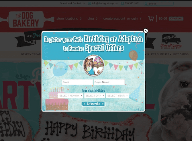
This popup from The Dog Bakery does things a little differently. Instead of asking for the customer to sign up, they’re asking them to sign their dog up to receive a special offer on their birthday.
This reversal of roles immediately makes this popup interesting and attention-grabbing. This is not asking for your details, it’s asking for your dog’s and are you really going to dismiss it and deny your dog a treat?
In order to provide all the wonderful dogs with treats on their birthdays, the popup also has a date selector.
If you are thinking about providing your customers with a special offer on their birthday, you might want to consider also adding their input fields to your popup. However, keep in mind that your popup conversion rate will suffer if you add too many fields.
As a rule of thumb, the fewer fields, the better.
One way to make the signup process easier if you ask for people’s birthdays is to make that particular question optional. Also, only asking for the day and the month eliminates one field which some customers won’t be comfortable with providing the year anyway.
5) Cart abandonment exit-intent popup
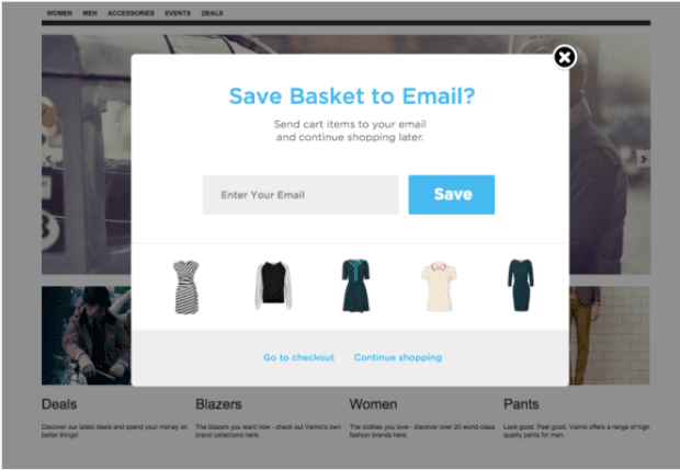
One way to reduce the likelihood of your popup annoying customers and disturbing their shopping experience is to have an exit-intent popup.
These popups will only show when a customer is about to leave your store anyway.
While you can add exit-intent popups to any page on your site, the example above of the showing items the customer has already added to their cart is a particularly ingenious example.
Cart abandonment is an incredibly common problem facing merchants, however, this particular popup aims to help mitigate the problem while also collecting email addresses.
The ability to save items in your cart to your inbox will likely appeal to a significant portion of shoppers who are still interested in eventually checking out. And even if they don’t end up converting, the merchant now has their email address.
6) J.R. Dunn
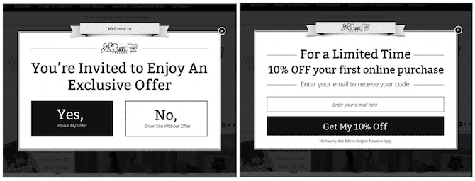
Most email popups present customers with everything in the one window. J.R. Dunn on the other hand splits their popup into two different parts.
The first invites customers to reveal their ‘exclusive offer’. This is a no-brainer when you don’t have to do anything apart from click yes and the sense of mystery further entices people to reveal their offer.
After agreeing to the first question, the 10% off your first purchase offer in exchange for signing up for their email list is revealed.
By this second stage, the customer is already more invested in the popup and securing their offer than they would have had the 10% off special offer been visible from the start. Some customers will likely think ‘I’ve revealed my exclusive offer, I may as well secure it now’.
Sign-up to our newsletter and receive a 30% discount on your first 6 months with SmartrMail
7) Tile Mountain
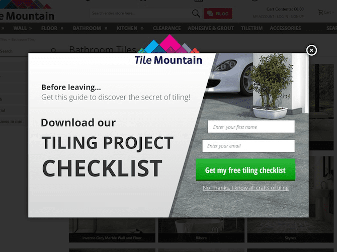
Title Mountain’s popup here is a perfect good example of everything done well: It’s an exit-intent popup so any friction is kept to a minimum, there’s a simple form to complete that includes the customer’s first name for personalization later on, and there’s a big eye-catching call-to-action button.
What is particularly interesting about this popup from a commerce perspective, however, is how it’s not offering a particular percentage or dollar amount off a customer’s purchase.
It’s also not just asking people to sign up for their email list with a vague promise of keeping them up-to-date with their latest news.
They’re offering customers something of value that doesn’t eat into their margin.
In this case, it’s a tiling checklist which is something customers browsing their site are likely interested in. For some customers, a guide like this might even be more enticing than a coupon if they’re just looking at options and not yet ready to purchase.
Either way, Tile Mountain is collecting email addresses they can later use to convert browsers into paying customers by providing customers with something of value.
If you don’t want to give away too much margin with your popup, have a think about similar guides or other downloadable content your customers would be interested in to include instead.
8) Tigerlily Swimwear
Tigerlily Swimwear’s website is bright and colorful, which makes their black and white popup stand out and grab people’s attention. This contrast will help get shoppers to pause and properly take everything in.
While the opt-in incentive is not particularly compelling, all the key elements of any good popup are present: striking design, simple and quick form, and a message persuading people to sign up.
9) Lip Monthly
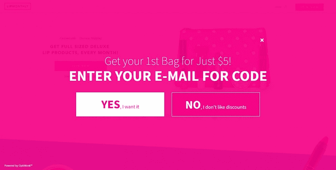
This is an example of an interstitial which means that it’s a full-screen popup that appears while the page is loading. This forces shoppers to pay attention to it in order to access the page they clicked through to.
Just like with J.R. Dunn, the popup asks whether people want to receive the offer before presenting them with an email signup form. It still makes it clear you have to enter your email address in order to receive the special offer, but the absence of any form means that signing looks to be as simple as just clicking ‘yes’.
10) MyDeal.com.au
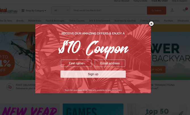
The last popup is one from MyDeal.com.au that shows how a simple design can be effective with a basic background image and a creative font.
Again, all the key elements are present and the popup also asks for the shopper’s first name so that they can personalize the emails they’ll send later. There’s also a clear hierarchy with the offer being the first thing that grabs people’s attention followed by the call-to-action button.
What would be nice is if this button contained a unique call-to-action instead of just ‘sign up’.
Conclusion
These ten examples will hopefully provide plenty of design inspiration when coming up with your own popup for your store.
If you’re looking for a popup app to create your own, SmartrMail has a free popup tool that lets you easily create beautiful, eye-catching popups like the examples above with a drag & drop builder.
The best part is that the popup is completely free as well.
Unlike other apps, there’s no limit to how many visitor sessions or pageviews the popup will be shown for or how many email addresses you can collect with it.
If your store is built with Shopify, Bigcommerce, Neto, PrestaShop, or WooCommerce, you can install SmartrMail and start building your popup here.
Otherwise, you might also be interested in checking out our list of the top Shopify popup apps.
For resources on creating mobile popups, check out our guide on mobile popup best practices here.
Read summarized version with