Popups are one of the easiest and fastest ways to grow your email list for your jewelry store.
And it’s not just collecting email addresses that they’re great at either. Popups are also useful when it comes to advertising offers, coupon codes, and reducing cart abandonment.
But if you’ve ever run a popup on your store, you’ll know that the challenge isn’t setting them up, but getting customers to engage with them.
So, to help you with designing popups that convert, we’ve put together this collection of 10 great examples from some of the top jewelry brands to inspire your own.
Examples of effective Jewelry popups
1) Missoma’s general popup
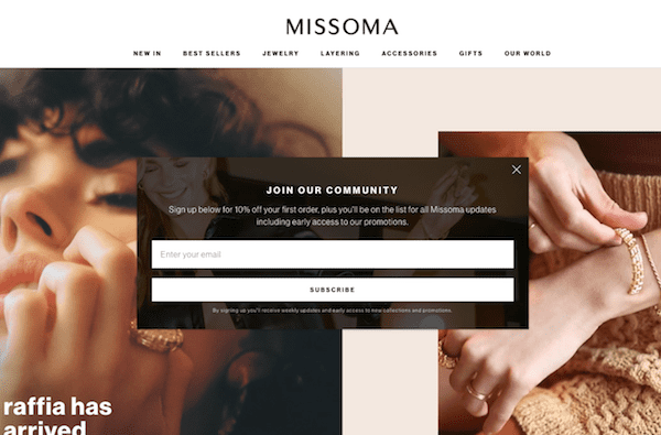
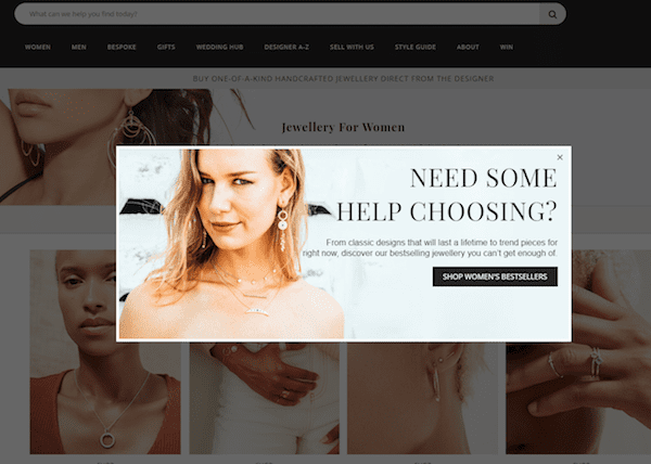
Missoma’s popup certainly lives up to the site’s reputation as one of the top online jewelry stores.
While it may not have any particular stand-out feature or design, it’s a good example of a general jewelry popup that does the job of collecting email addresses well.
The background image adds a nice touch to the overall design and the heading and body copy is original enough not to be boring.
The 10% offer one’s first order is also enticing and will help improve the overall conversion rate of the popup.
That said, this offer could be more visible and attention-grabbing.
With the popup’s current design, customers will only learn about the offer if they bother to read the body text. And as people tend to dismiss popups quickly, you’ll want to make sure whatever incentive you use is immediately obvious.
2) Example of a simple, typical design
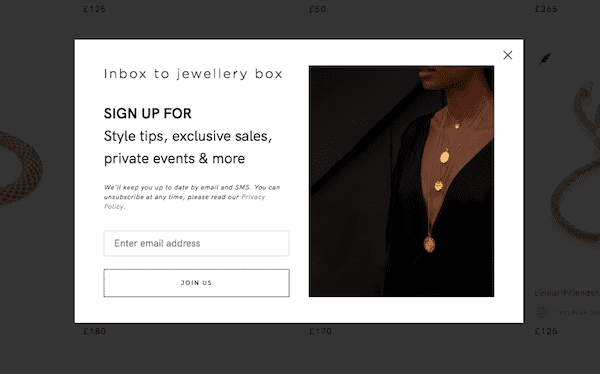
Sometimes the most effective popups are not the ones with elaborate designs but basic ones that get the fundamentals right.
While the opt-in incentive in this example isn’t as enticing, at least it’s more obvious and not hidden. There’s also a short description of what people can expect by signing up as well as a link to their privacy policy.
This goes to show you can quickly and easily create an effective popup without having to agonize over its design too much.
3) YCL Jewels
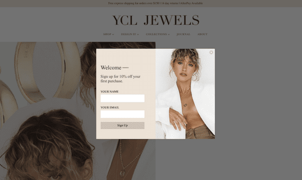
Another example of a simple and well-designed popup, this example from YCL Jewels also asks for customers’ names.
Collecting this information will let them personalize their email campaigns later on which will help boost their effectiveness.
While adding more question fields to your popup can harm its effectiveness, you can get away with just asking for someone’s email address and name. If you want to be really safe, you can also make the name field optional.
4) Highlighting the opt-in incentive
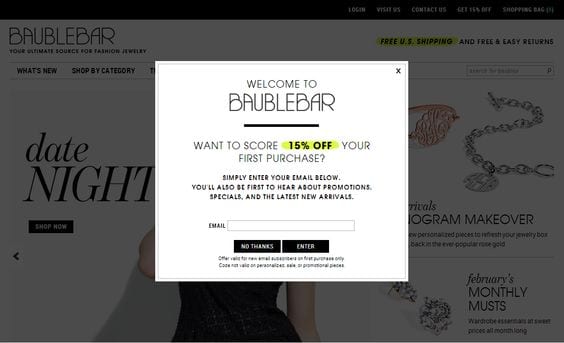
Some of the popups of the list so far, while well-designed, haven’t the best job of highlighting their opt-in incentive.
Not this example from Baublebar however. This one quite literally highlights the offer with a highlighter effect and bolded text.
This makes it the first thing people’s attention is naturally drawn to which helps massively with improving the conversion rate.
While the rest of the popup design may not be particularly inspiring, this is a good example of one that gets hierarchy right.
Sign-up to our newsletter and receive a free eBook with hidden Email Marketing Tips
5) Kate Spade Saturday
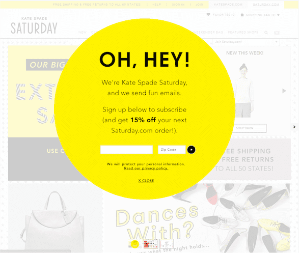
Talk about an attention-grabbing popup design.
This example from Kate Spade Saturday probably has the most stand-out design on the list thanks to its bold color choice.
The copy “OH, HEY!” also does a good job of attracting attention. All of this makes it impossible to miss this popup.
The opt-in incentive is then also bolded in the body talk to help it stand out and entice people to sign up to their email list.
6) Popup offering relevant content
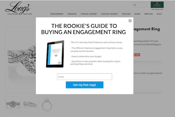
What this popup lacks in the design department, it more than makes up for in its relevancy.
Being triggered on engagement right product pages only, the offer of a free guide on choosing the right ring is likely to resonate with a fair percentage of people who see it.
It also goes to show that you don’t need to just offer a monetary incentive like 10% or $20 off to grow your email list.
Often a well-placed and relevant guide like this will perform just as well, if not better, and save you plenty of margin.
Check out our huge range of Jewelry store templates on SmartrMail
? Install SmartrMail and use our Jewelry store templates today ?
7) Exit intent popup
Unlike the other examples on this list, this exit-intent popup doesn’t aim to collect email addresses.
Instead its goal is simply to reduce browse abandonment by being triggered when someone goes to close the page or visit another site.
By redirecting people to their bestsellers, customers who would’ve otherwise have left their site are hopefully shown something that will interest them, giving the jewelry store another chance to make a sale.
8) Gamified spin-to-win popup
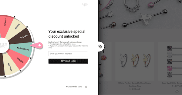
Gamified popups have grown massively in popularity over the past few years.
The interactive element and prospect of winning a prize makes them more enticing which is why they can achieve a conversion rate up to twice that of regular popups.
The other thing to notice about this design is that instead of just being a window in the middle of the screen, it takes up the entire left half of the screen.
While this ensures that shoppers must interact with it (even if just to dismiss it), you should be conscious of the impact it has on your customer experience if you decide to go with something similar.

9) Non-intrusive side popup
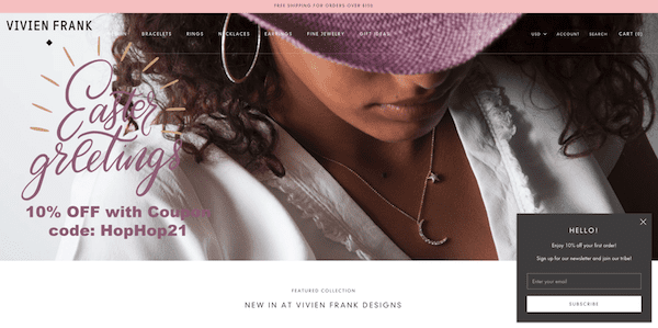
If your main concern is not interrupting your customers’ shopping experience, then you might want to consider a non-intrusive side popup such as the one Vivien Frank has on their store.
Going for a smaller design and having it display only in a corner as opposed to right in the middle of the screen helps ensure you don’t annoy people browsing your site.
The tradeoff, however, is the smaller and less intrusive you make your design, the fewer people may end up subscribing to your email list.
10) Popup asking for customers’ birthdays
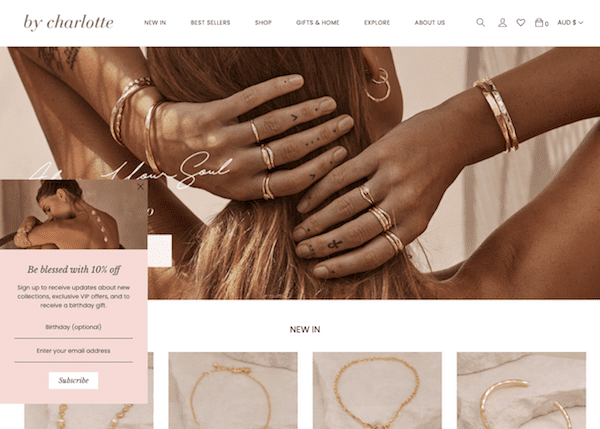
By Charlotte also has a side popup that’s a bit more attention-grabbing with its contrasting color and image at the top.
This helps it strike a good balance between being noticeable and not needlessly interrupting the shopper’s experience.
The other thing this popup does that others on this list don’t is ask for customers’ birthdays.
This is so that they can send their customers birthday email campaigns later on.
So that this question doesn’t negatively affect their conversion rate, they’ve made it optional and also explained why they’re asking for it. Two things you should do too if you also want to ask for customers’ birthdays.
The rest of your jewelry store
Hopefully now you have plenty of inspiration for your jewelry popups. But why stop there?
We also have a collection of great jewelry stores on Shopify in case you are looking for inspiration for the rest of your online store’s design.
Once you start collecting email addresses with your new popup, we also have a comprehensive guide to email marketing for jewelry stores so you can make the most of your email list.
And once you start email marketing, you can find jewelry email design inspiration here.
For more tips for your popup, check out our guide on popup design best practices.
Read summarized version with